Urban Fabric Recruitment
Complete brand setup from logo to website for property management recruitment startup.

Project overview
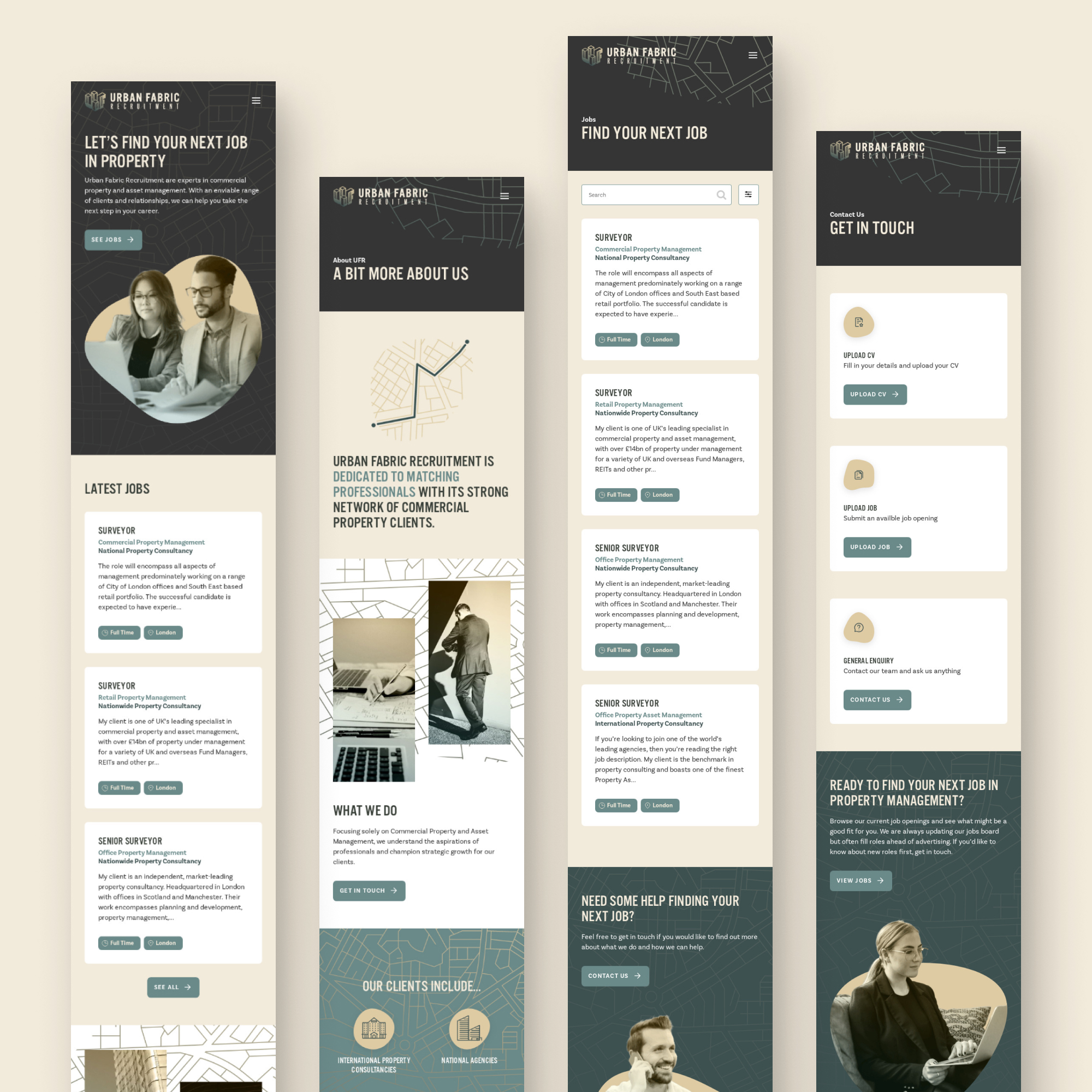
Urban Fabric was the brainchild of an experienced recruiter, who split off from their previous company to start their own venture, a recruitment startup that specialises in property management and surveyors. As a fledgling business, they needed to create a company image and an online presence from scratch. Grounded in the property sector Urban Fabric needed a brand that reflects their connection to the balance between the man-made and the natural, and a website to match. They wanted to build something exciting and modern, with a robust visual identity influenced by topography and cartography.
Process
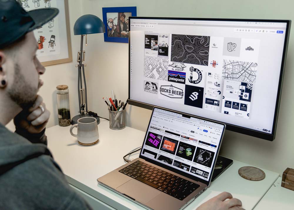
The goal was to kick start the growth of Urban Fabric with a completely bespoke website with an excellent user experience and a foundational brand package to create a standout aesthetic. The first step was to gather as much information as possible about the business needs and desires. A stakeholder questionnaire was distributed that collected data on the business message, current assets, potential website information architecture (IA), competitors within the area and any inspirational resources. Equipped with an understanding of the business message and what inspires the client a mood board was generated. This fed directly into the logo design, including building the colour scheme and aligning the typography, forming a foundational branding package. The remaining data from the stakeholder questionnaire informed the IA, specified in a site map, and the process of detailing the design requirements for the website. Next, an iterative design process resulted in the finalised UI design, which was then all developed in-house into a brand-spanking new website build for the very satisfied Urban Fabric Recruitment.
Client
Urban Fabric Recruitment
Agency
Havish Design
Duration
12 weeks
Discover
Stakeholder questionnaire
Mood board
Branding
Logo design
Branding package
Define
Site map
Design requirements
Design
UI design
Website build
Branding
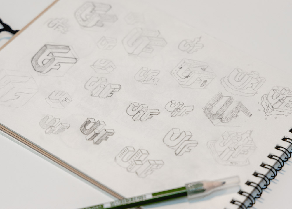
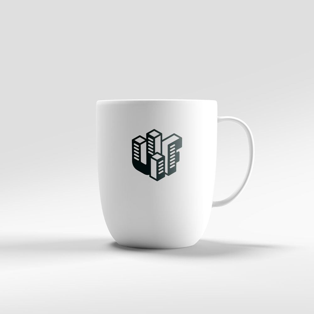
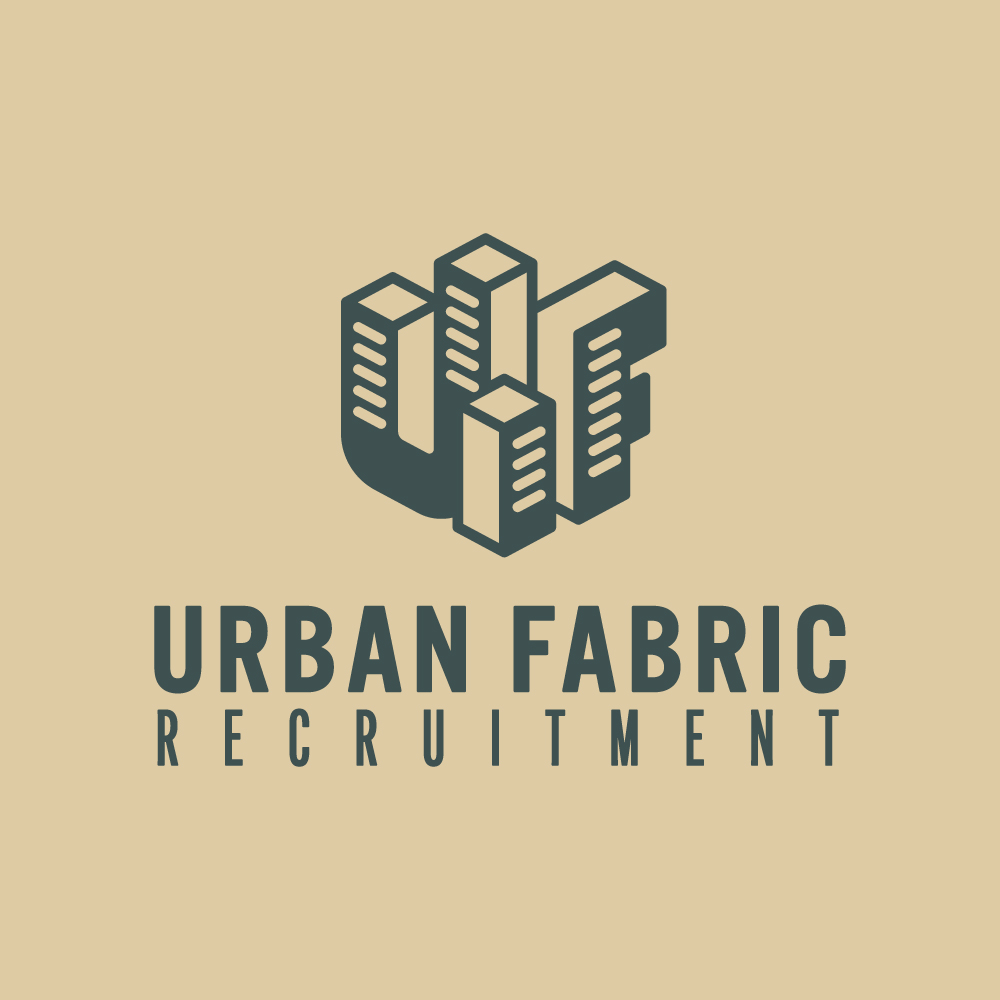
The company name originates from the fabric of city life and the intertwining buildings and streets. The client has a strong interest in maps and topography and wanted this reflected in the company image. At first, the mood board took more of a brutalist monochromatic direction. However, it was decided to implement colours that represented the duality between natural resources and urban development. The rich greens symbolise grass and trees and the sand colours for dirt and brick. In another light, the sand can seem gold in appearance and alongside the green tones, it translates to financial progress and prestige. Two web-optimised fonts were chosen for the typography, a bold header font that suited the original brutalist direction and an uncomplicated sans that lent itself to a clean UI design. Logo design evolved from many throwaway sketches to initially form two concepts, which were put in front of the client. A direction was chosen and tweaks were made to settle on the final form.
Mood board
View this asset in more detail


Design requirements
The data from the stakeholder questionnaire provided foundational guidelines when detailing the design requirements, supplemented by knowledge of current best practices and the market landscape. Furthermore, it gave insights into what content the client expected to be on the website. Based on that, a recommended IA was formulated and laid out visually in the form of a site map. The website has two types of users; candidates and clients. Candidates looking for a new job must feel confident that Urban Fabric can provide support. Clients provide those potential jobs and must be able to use the digital service without fuss.
Site map
View this asset in more detail
A website design language that is in line with the growing company brand.
Multiple contact forms for specific user tasks, e.g. upload a CV, upload a Job and a general enquiry.
Use of topographic illustrations to enhance the design as well as photos to make it more personable.
Coded with a focus on SEO to improve searchability and Google rankings.
User-friendly admin area so content can be quickly and easily updated.
A logical layout of content so potential clients can obtain information painlessly.
An easy-to-update jobs board that will display all current vacancies on the front end.
Fully responsive website to make it desktop, tablet and mobile friendly.
Website design
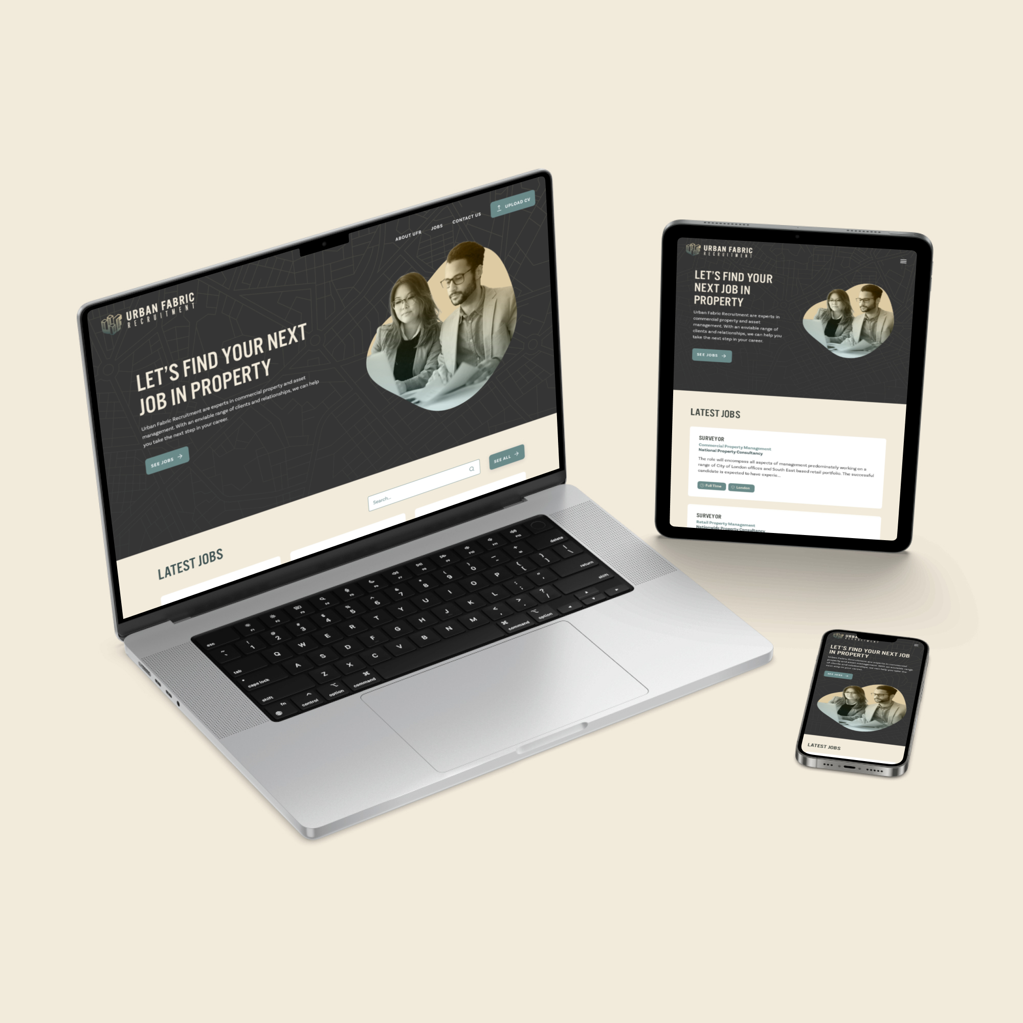
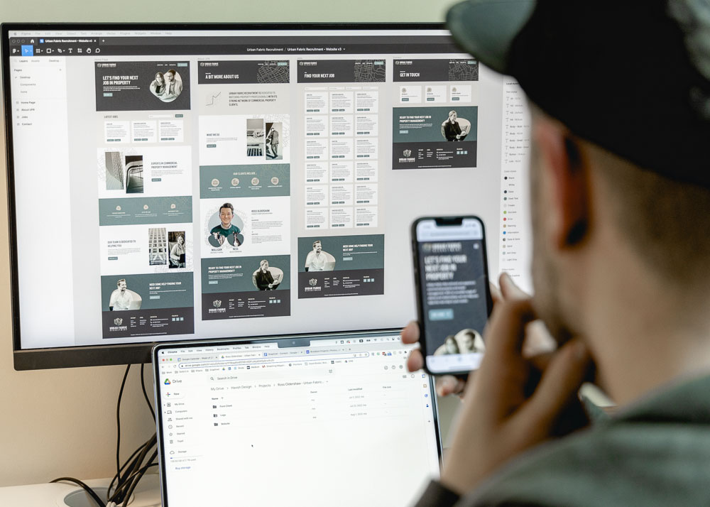
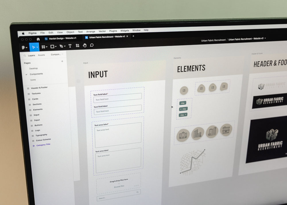
Following the design requirements, the branding package and IA, hi-fi screens were designed using Figma. To set up a design environment for efficiency and agility, the design system developed by Havish Design was adapted to organise components, colours and typography for this project. First, the home page was designed and delivered to the client to present the overall look and feel. Feedback was incorporated into further iterations and the remaining pages were created. Once the dev-ready designs were signed off, the bespoke website was developed and prepared for a painless release.
Design files
View the original Figma file
UFR Website
View the live website


Project reflection
The project undertaken for Urban Fabric Recruitment was a relatively cut-and-dry process, one that has been tried and tested at Havish Design. The overriding benefit was that the client felt guided throughout and comfortable with the direction it took at each stage. This helped the project to run smoothly and relatively painlessly. The result was that the client received something that exceeded their expectations, all on time and within budget. The lesson here was if it isn’t broken, don’t fix it.
More projects
Yapari: AI-Powered Learning
AI-powered learning that transforms curiosity into action, generating gamified courses on any topic for accessible, engaging education.

Simplifying Ticket Buying
Elevated the Event Details Page with a modern design and smoother ticket selection, delivered through incremental improvements.
Redefining the Smart Queue
A fan-first vision that makes waiting painless through proactive prep, guidance, transparency, and a flexible, accessible UI.
