Antum Loyalty App
Fast-paced project operating on agile sprint cycles to deliver dev-ready UI designs for a loyalty app and website.
Project overview
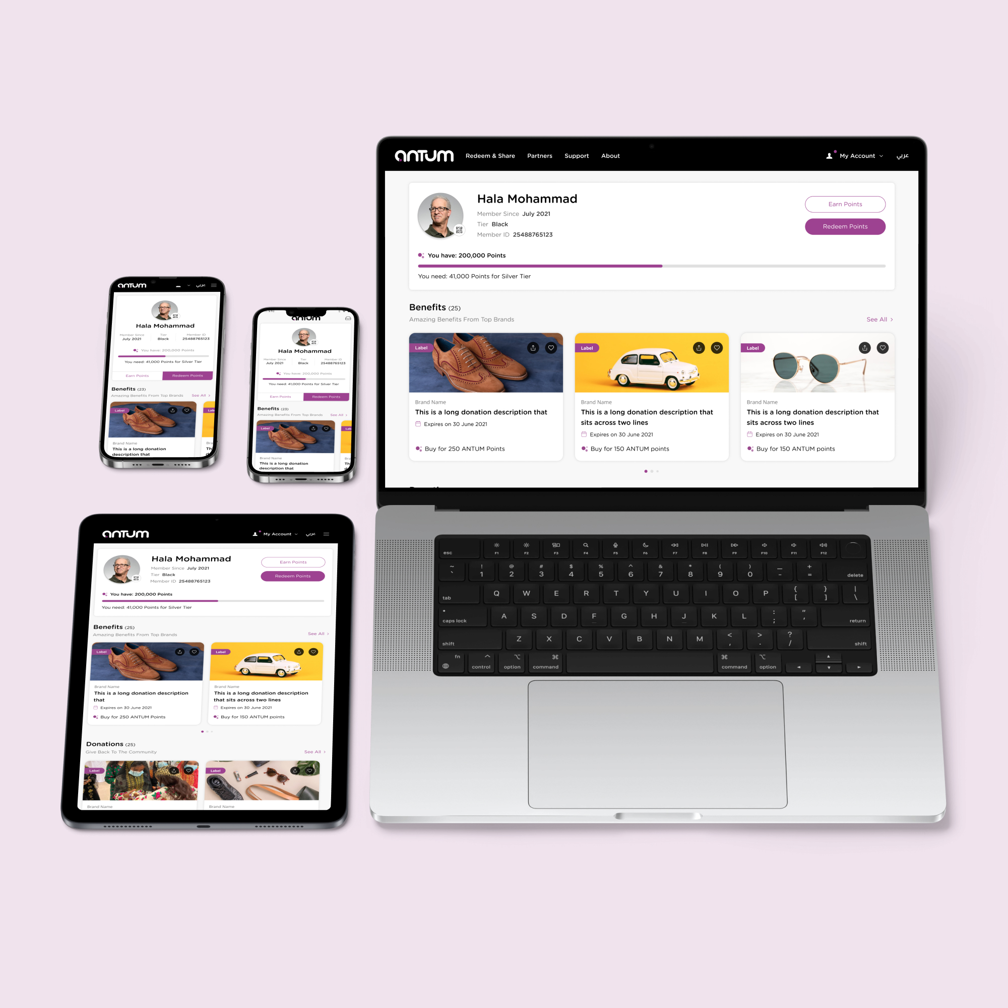
This project was undertaken for the Fawaz Alhokair Group (FAH), the largest developer, owner, and manager of department stores and fashion retail in Saudi Arabia. The goal was to develop a multi-brand loyalty programme with online initiatives and rewards for patrons of their department stores. One aim was to bring together partners currently outside FAH adding value by covering more of the customer needs, including utilities, banking and travel. The experience of the loyalty programme needed to be seamless, multichannel, fully responsive and available as a native app, as well as a website. By creating a great user experience, the loyalty programme would help FAH achieve a wide range of business objectives, including, attracting new customers, increasing repeat purchases, improving customer retention and enhancing the overall customer experience. A team of UX/UI designers, formed by Designit, was tasked to design the digital experience for the loyalty programme based on a detailed set of functional requirements, established from previous research efforts.
Process
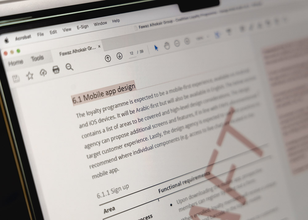
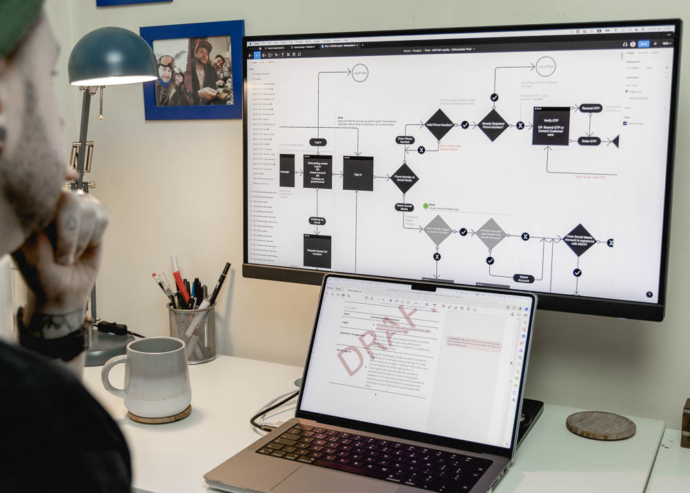
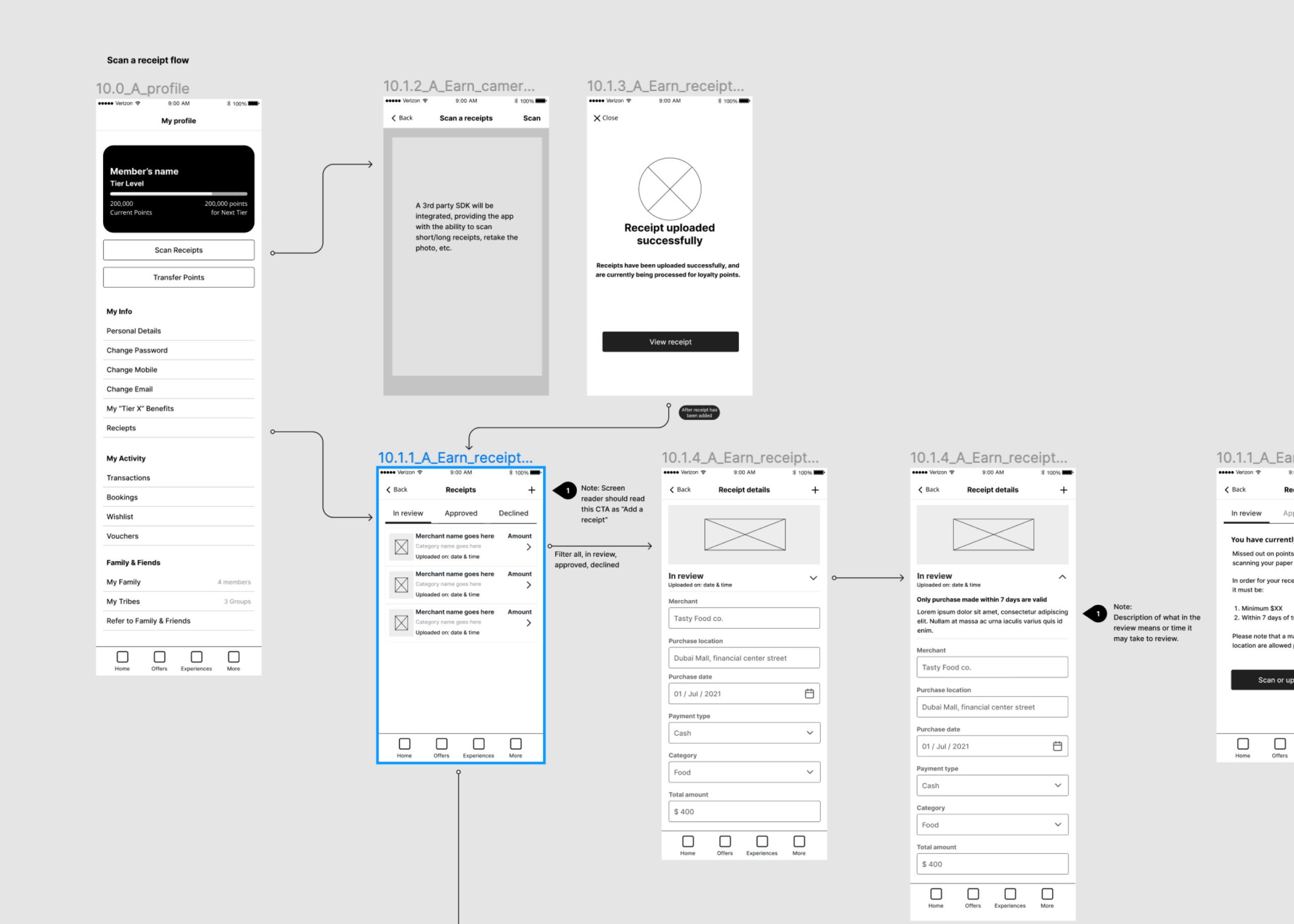
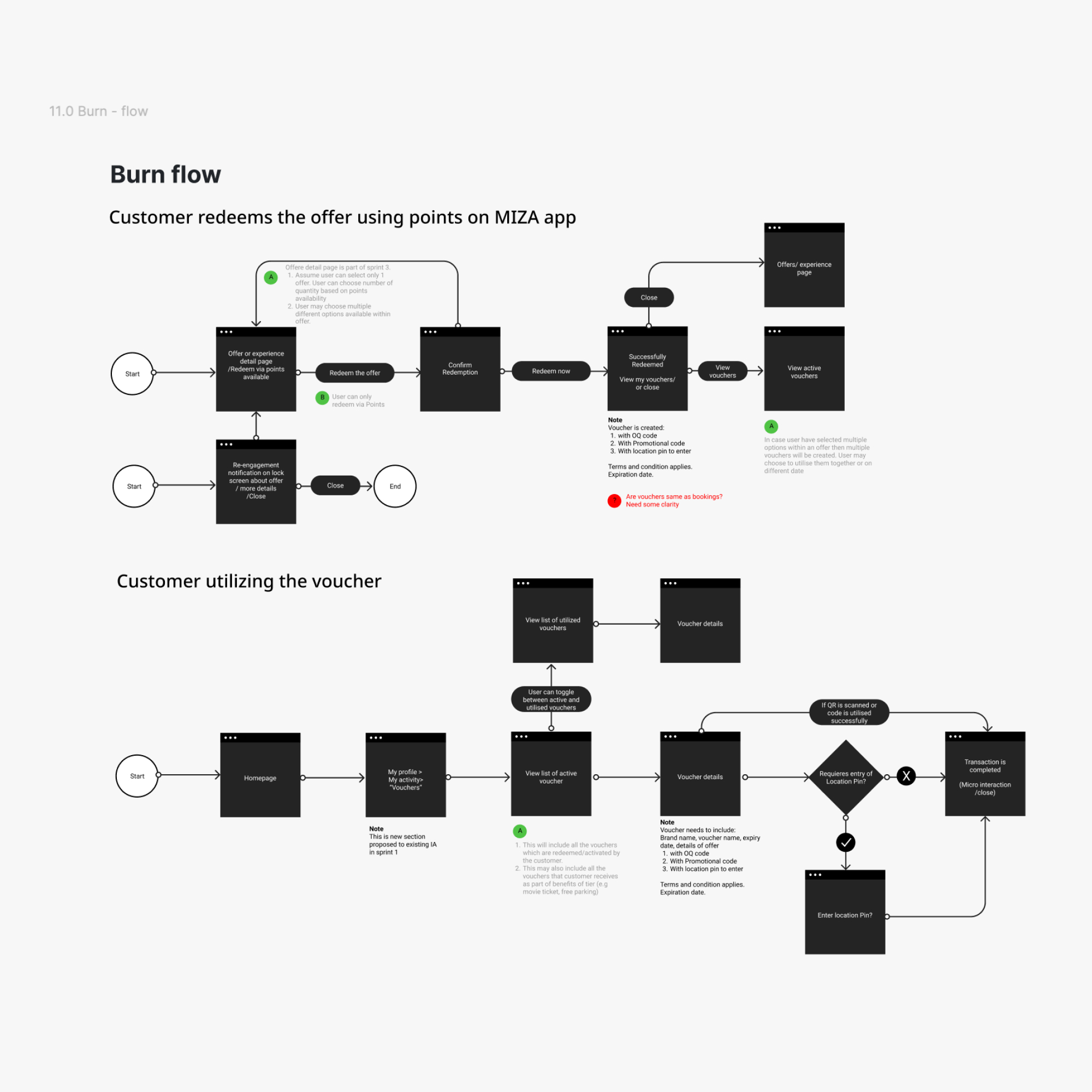
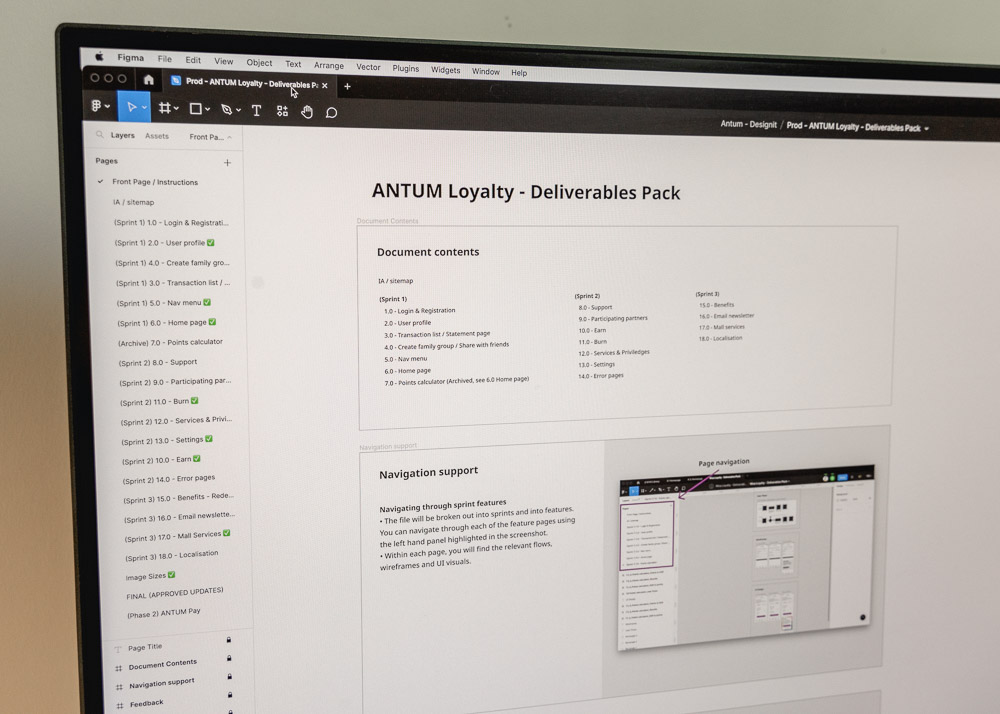
Before this contract of UX/UI design work, extensive research had been conducted to uncover the project requirements, business objectives and customer needs. This provided competitor benchmarking, customer archetypes and trend insights, which formed the experience principles and functional requirements in the brief. First, this comprehensive design brief, among other documents, was digested by the project team during a document review. Next, the features expected to be built into the digital experience were outlined in a series of user flows. These specified what screens and interactions needed to be designed, therefore for each feature flow a matching set of low-fidelity wireframes was created in Figma, determining page structure. Alongside the development of the design brief, a branding concept had been created, and this drove the direction of a mood board, dictating the look and feel of the product. Equipped with this, the wireframes were elevated into high-fidelity UI design. To ensure the development of such extensive UI was consistent and efficient all components, icons and styles were built and meticulously organised into a custom design system. Here, a localisation team was brought in to convert everything into Arabic. Screens for each of the features were organised into a deliverables pack in Figma, where the client team could leave feedback until design amendments were ready for sign-off, resulting in a complete dev-ready design document.
Client
Fawaz Alhokair Group
Agency
Designit
Duration
6 weeks
Define
Document review
User flows
Ideate
Wireframes
Mood board
Design
UI design
Design system
Deliver
Deliverables pack
Design sprints
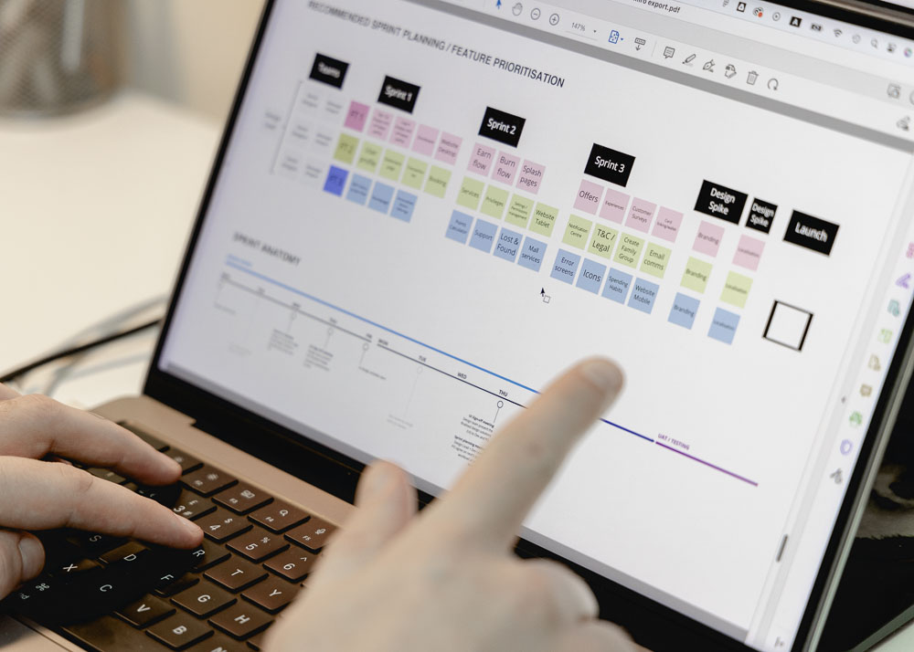
The scope of this project was immense for the relatively short amount of time allocated. With only 6 weeks from start to finish, the project needed clear organisation within the team and manageable sprint cycles. The group of 6 UX/UI designers was split into 3 feature teams, each ready to tackle a portion of the total 34 product features across 3 sprints, lasting 2 weeks each. Each sprint would consist of first creating the user flows for each feature, then the lo-fi wireframes and finally developing those into hi-fi UI designs, following the direction of the mood board and creating necessary components along the way. After each key deliverable had been delivered it would be added to the client-facing deliverables pack, where feedback was gathered and actioned before moving forward. Once all specified features were brought together as a whole, the final product would adhere to the experience principles; providing a seamless omnichannel experience, making users feel valued through special treatment, helping users to better themselves by aligning rewards to personal goals, and fostering a social vibe by forging real-life connections.
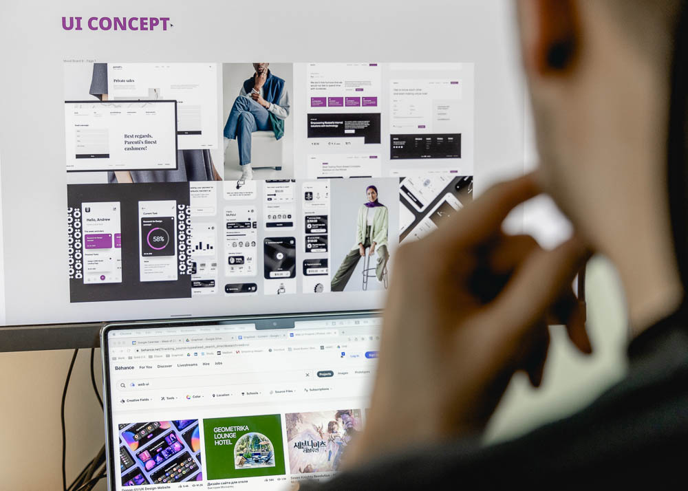
Mood board
View this asset in more detail
Early-stage design
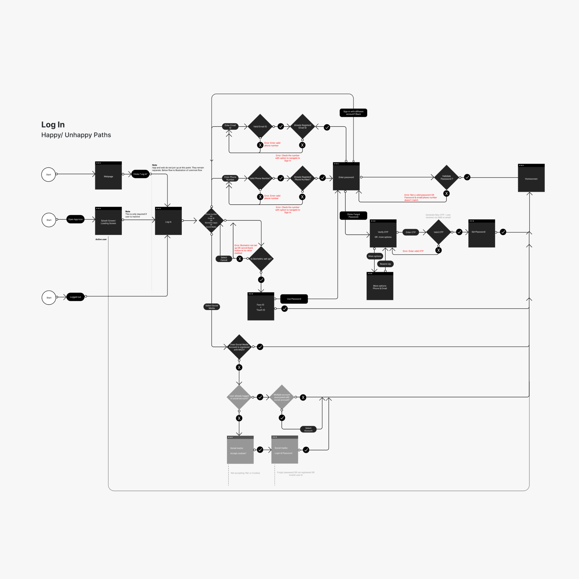
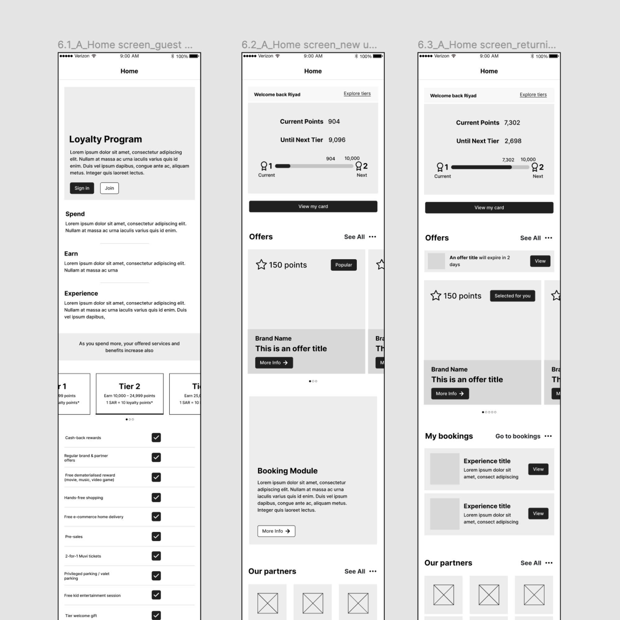
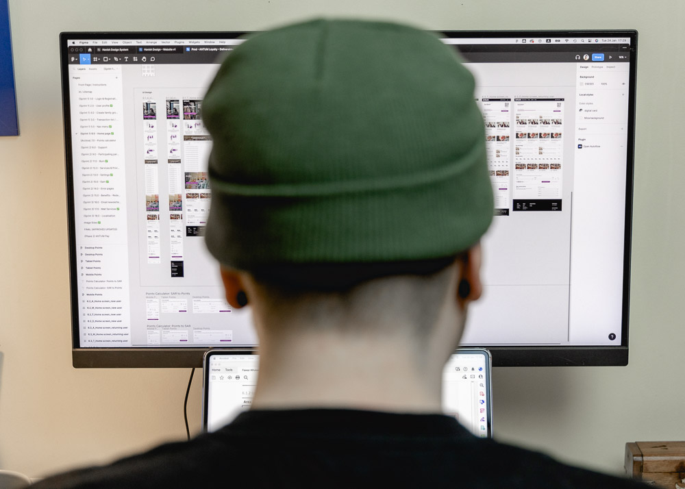
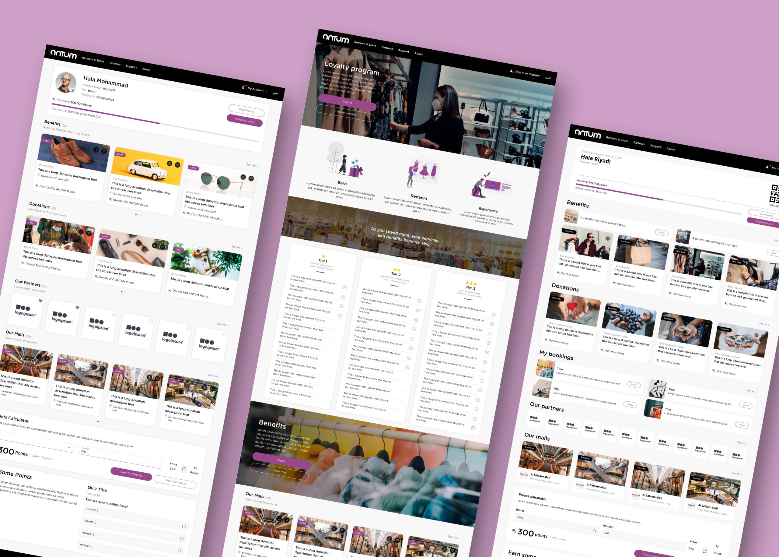
Each feature team had to tackle around 3-4 features per sprint. Using the highly detailed functional requirements in the brief, knowledge of best practices and logical reasoning work on the user flows started. These laid out the user’s movement through the product, mapping out each step from the point of entry right through to the final interaction. Defining the logic for each feature was vital as it helps to calculate the number of screens that needed to be designed, as well as confirm with the client their expectations of how the final product will function. Once the logic for a feature had been mapped out, lo-fi wireframes were sketched out for all required forms; native app, mobile web, tablet web and desktop web. These wireframes illustrated the space allocation, prioritisation of content, functionalities available, and intended behaviours. It was decided that all this work should be contained within Figma as it would streamline the transition to the final UI design and promote an organised and efficient working environment.
UI design
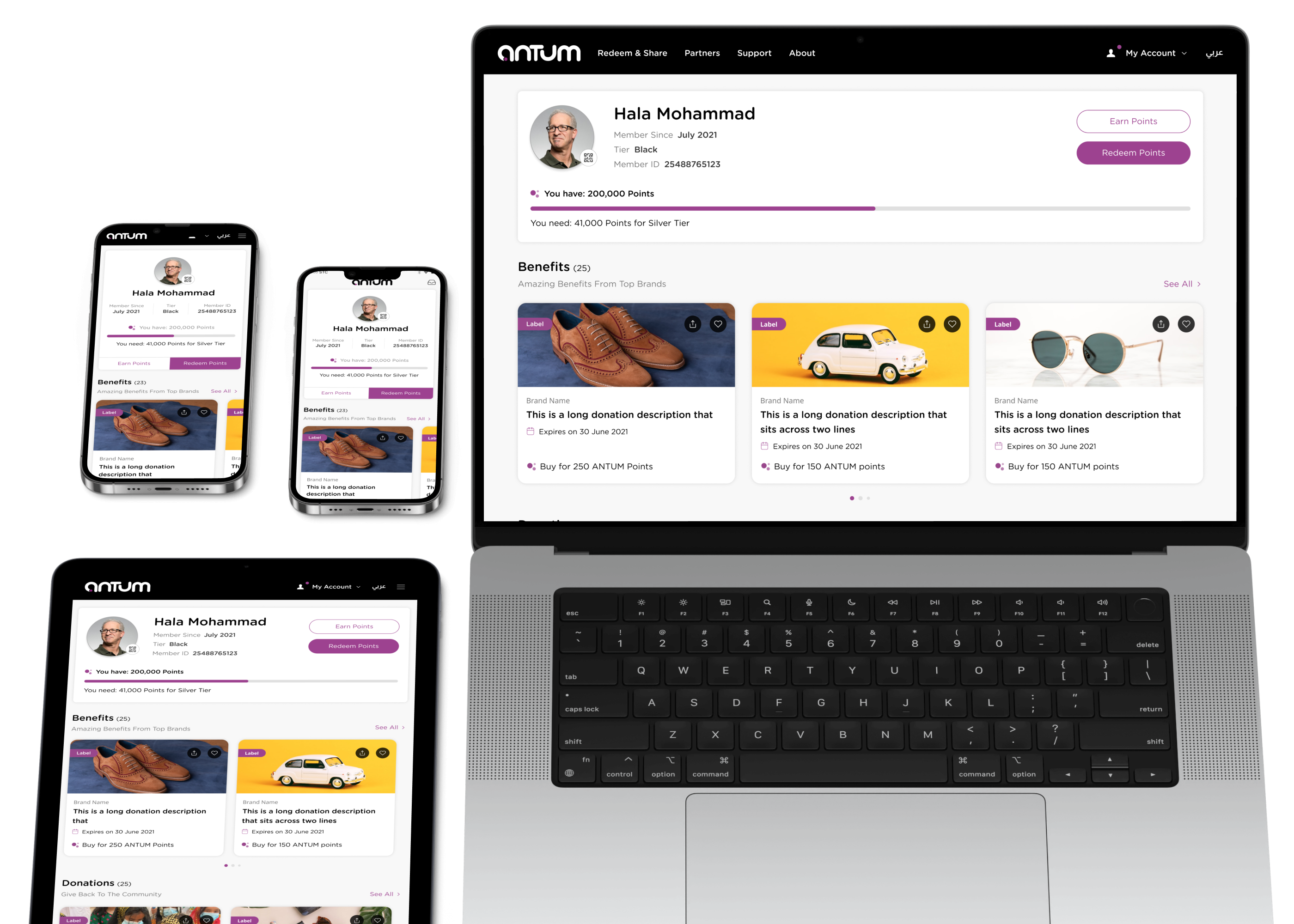
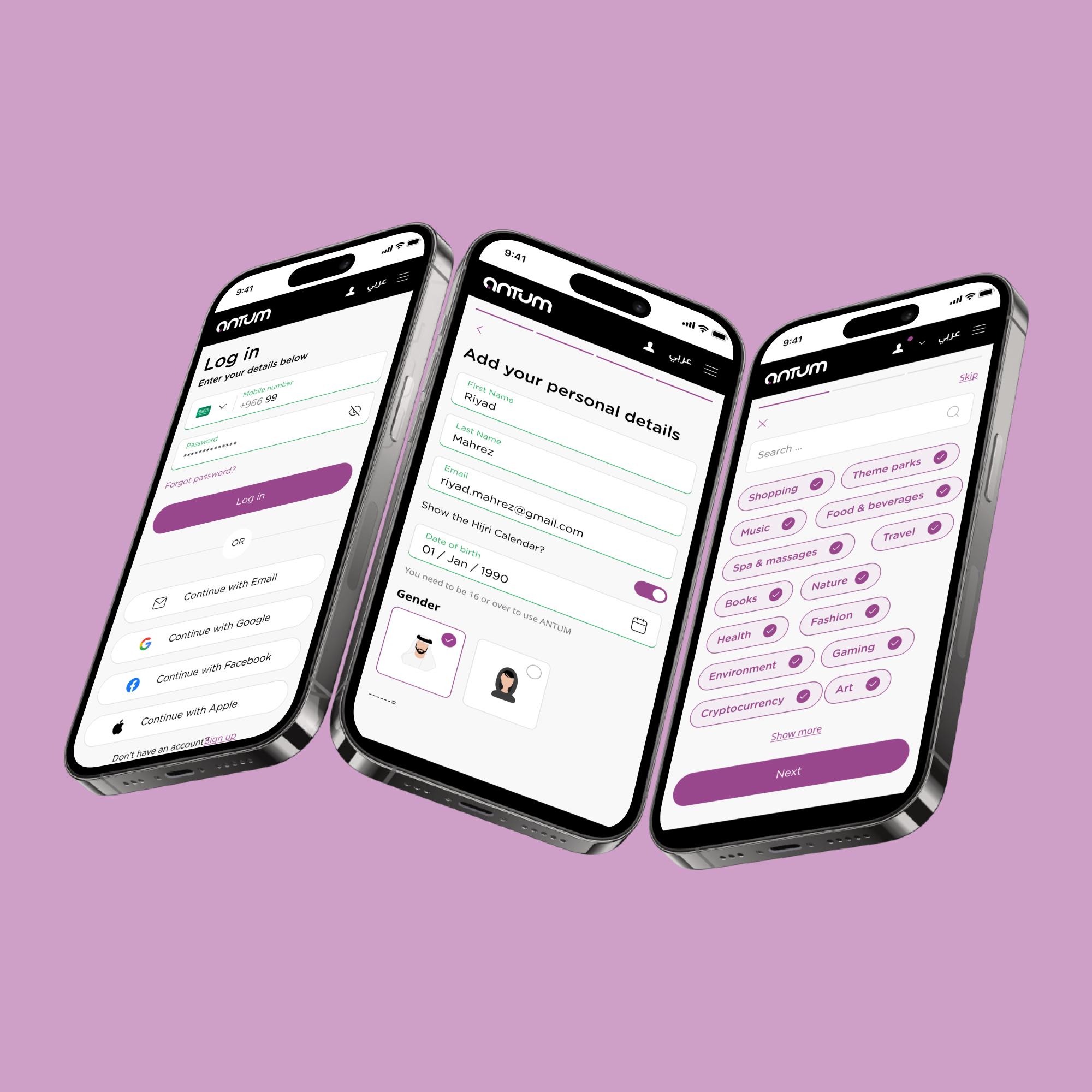
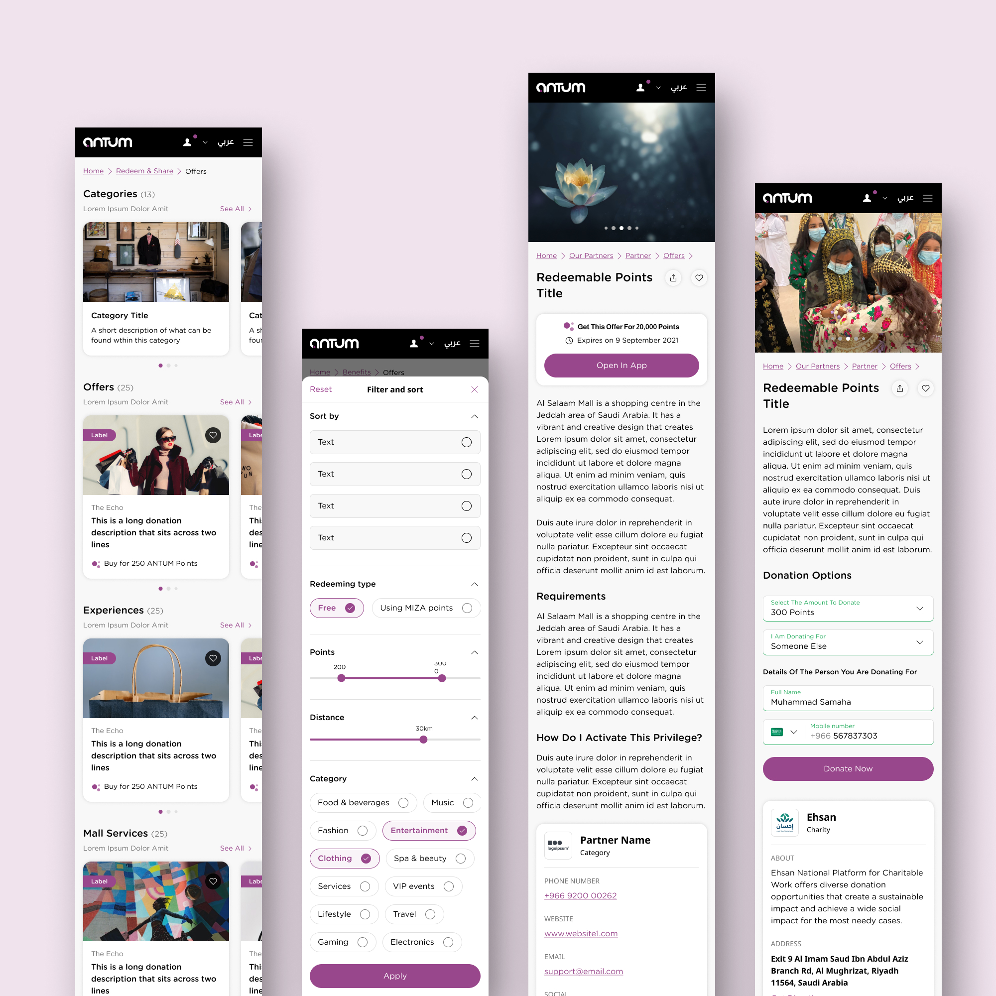
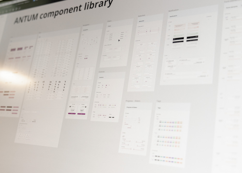
Starting with lo-fi wireframes first allowed for a large number of screens to be laid out with a great degree of agility. This considerably simplified the process of designing the hi-fi UI design. The mood board created at the beginning of the project followed the colour scheme and visual tone of the brand concept; a minimal, clean and modern feel utilising purple as the accent colour and bold imagery to invoke a luxurious impression. This drove the decision to choose a suitable UI library as a foundation for the design system. As screens were designed, components were built into the design system and integrated throughout the teams, increasing efficiency the more it evolved. Despite the smaller teams working individually through dedicated features lists, it was a highly dynamic working style where teams would share progress and collaborate when and where it was needed. The result was a complete translation of the user interactions, beginning to end, into a set of dev-ready screens organised into a comprehensive deliverables pack.
Deliverables pack
View this asset in more detail
Design system
View this asset in more detail
Project reflection
This project was quite a testament to the way that remote design teams can work efficiently if equipped with the correct tools and backed up with solid planning and organisation. With the project lead in Germany, the design lead in Indonesia, the client in Saudi Arabia and the design team split up between the UK and India, it was truly an international effort. This increased the importance of sensitivity to everyone’s working styles and flexibility to overcome inevitable barriers. However, keeping everything within Figma and meticulously following the design systems allows for a great amount of work to be completed with speed and agility. Furthermore, designing within the design system meant the process of localising the UI was also as simple as possible, despite this requiring flipping the alignment of all the components to flow right to left, which is natural for Arabic-speaking users.
More projects
Yapari: AI-Powered Learning
AI-powered learning that transforms curiosity into action, generating gamified courses on any topic for accessible, engaging education.

Simplifying Ticket Buying
Elevated the Event Details Page with a modern design and smoother ticket selection, delivered through incremental improvements.
Redefining the Smart Queue
A fan-first vision that makes waiting painless through proactive prep, guidance, transparency, and a flexible, accessible UI.
