Fallen Oak Frames
Bespoke website and rebrand for a traditional carpentry and oak frame restoration specialist.
Project overview
Fallen Oak Carpentry deals with all aspects of traditional oak frame carpentry. Using techniques handed down through generations Fallen Oak specialise in fitting green oak frames and restoring listed buildings. As a new facet of the business, they created a range of garden frames to be marketed as relatively out-of-the-box products to complement their highly bespoke service. The company had the beginnings of a brand, albeit basic and needed it to be more functional. Their only online channel was Instagram and they needed a website to push the business, especially the catalogue of new garden products. Fallen Oak wanted a brand that respected the traditional values of their craft and a platform to show off the product imagery.
Process
The proposal for Fallen Oak was to build a completely bespoke website with an excellent user experience and to create a foundational brand package to boost their company image, showing off their refined craft. First, a stakeholder questionnaire was distributed to gather insights into the current state of the business, including their needs and desires. This provided an understanding of the business message, current assets, potential website information architecture, competitors within the area and any inspirational resources. Next, a mood board was produced based on what Fallen Oak stands for and the features of the client’s inspiration. This drove the development of the branding package, which comprised the logo design, colour scheme and typography. For the purposes of the website, a competitor analysis was conducted leveraging data collected from the stakeholder questionnaire, allowing the design requirements to be defined. Next, the UI design was developed through an iterative process working closely with the client, aligning with their needs. Once finalised the website build was developed in-house resulting in a website that allows for Fallen Oak’s beautiful craft to shine.
Client
Fallen Oak Frames
Agency
Havish Design
Duration
12 weeks
Discover
Stakeholder questionnaire
Mood board
Branding
Logo design
Branding package
Define
Competitor analysis
Design requirements
Design
UI design
Website build
Branding
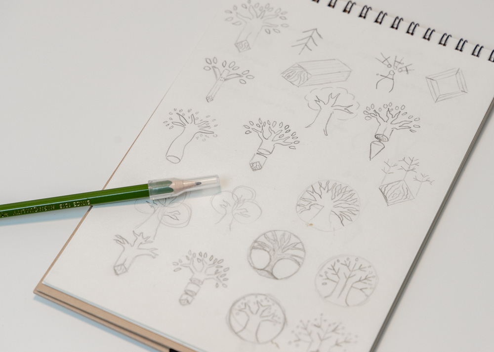
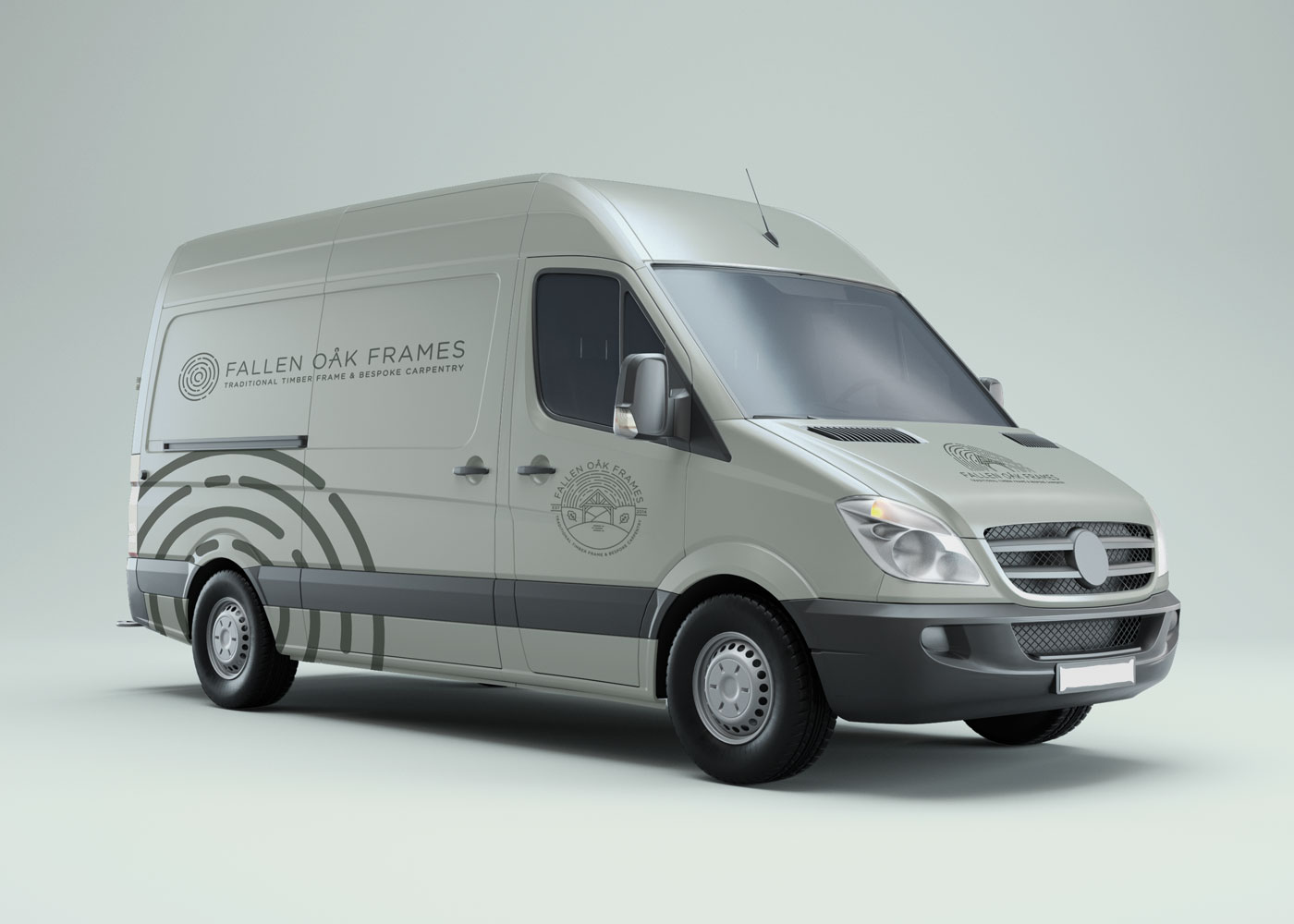
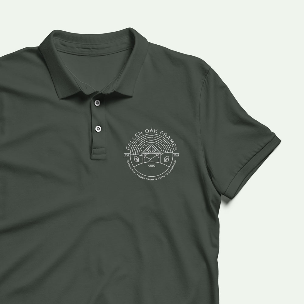
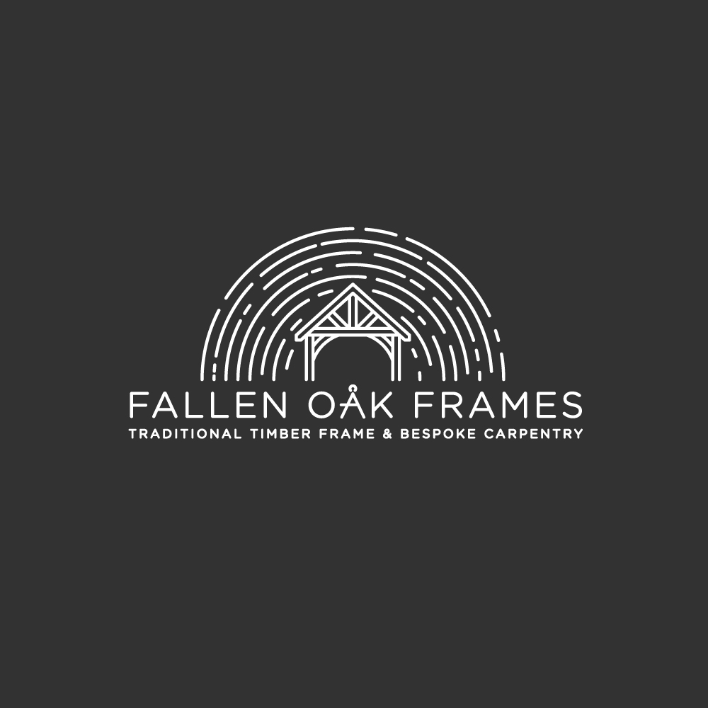
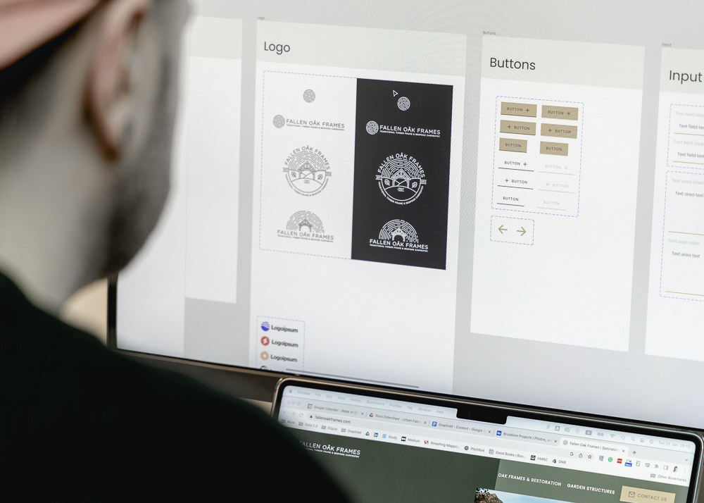
At the heart of Fallen Oak Frames is the knowledge and respect for traditional carpentry techniques and oak timber, which has been passed down through the family. This needed to be worked into the brand and the client was keen to integrate tools that have been used for hundreds of years. One requirement for the logo was that it also needed to work well as a stamp either embossed into a metal plate or branded straight into the wooden frame. As a result, the inspiration gathered in the mood board led the logo to be monochromatic and to use simple clean lines ensuring it pops from the background. Initially, a lighter palate was considered, however, the client preferred much darker colours using dark earthy greens and black as the primary colour scheme. These were complemented by a bright gold hue to be used for the accents and interactive elements, together achieving a distinguished and natural feel. A soft linear font was customised, swapping out the “a” for a traditional divider tool, and used only for the logo itself, whereas a web-optimised sans font was utilised in the UI design to maximise utility. Two logo design concepts were developed that evolved from a series of sketches. After presenting to the client, there was a standout direction that closely matched the one initially discovered in the mood board. A few iterations later, the final form was finalised, including responsive logo alternatives to optimise functionality.
Mood board
View this asset in more detail


Design requirments
The recommended information architecture (IA) and design requirements were detailed using the data gathered from the stakeholder questionnaire, which provided insights into the client expectations and needs, as well as the competitor analysis that improved understanding of the market landscape. Before proceeding with the design the IA and requirements were approved by the client. Users’ desired behaviour and the end goal are simple; to make an enquiry about booking in Fallen Oak for a project. However, the site provides two clear journeys for the different services, the first being for a customer that needs large-scale framing or restoration, the second being for those interested in garden structure products. The structure of the website is anchored on this distinction and the information is organised to guide the user effortlessly to their goal.
Competitor analysis
View this asset in more detail
The website design must follow the specifications of branding guidelines and build the company image.
Potential clients must be guided to a simple contact form for them to enquire about a new project.
Built with a user-friendly admin area to ensure that content can be easily maintained.
Created using a component library and a style guide to streamline the design process.
Logical IA that painlessly guides users through their journey to the intended goal.
A page that displays the garden structure products that can be easily managed by the webmaster.
Use of professional photos that showcase the services and products that the company provides.
Designed to be optimised on desktop, tablet and mobile making it fully responsive.
Website design
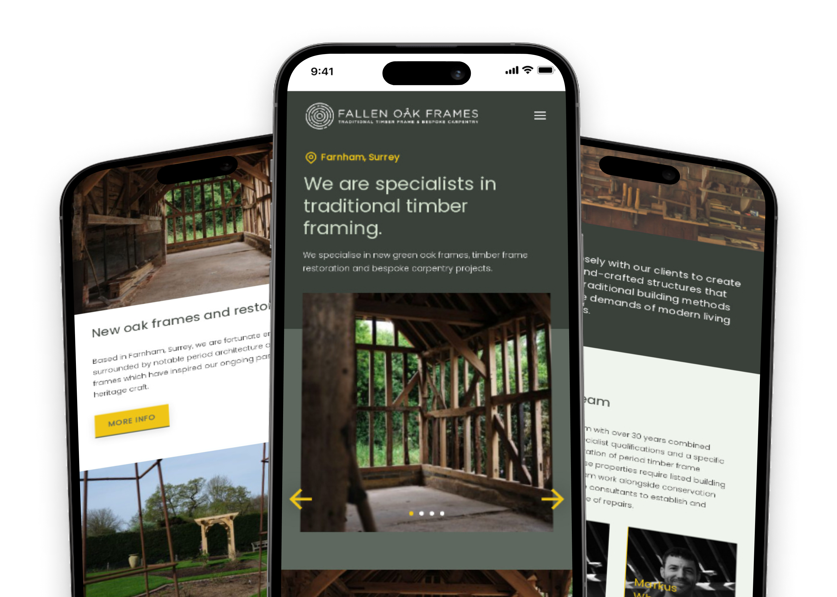
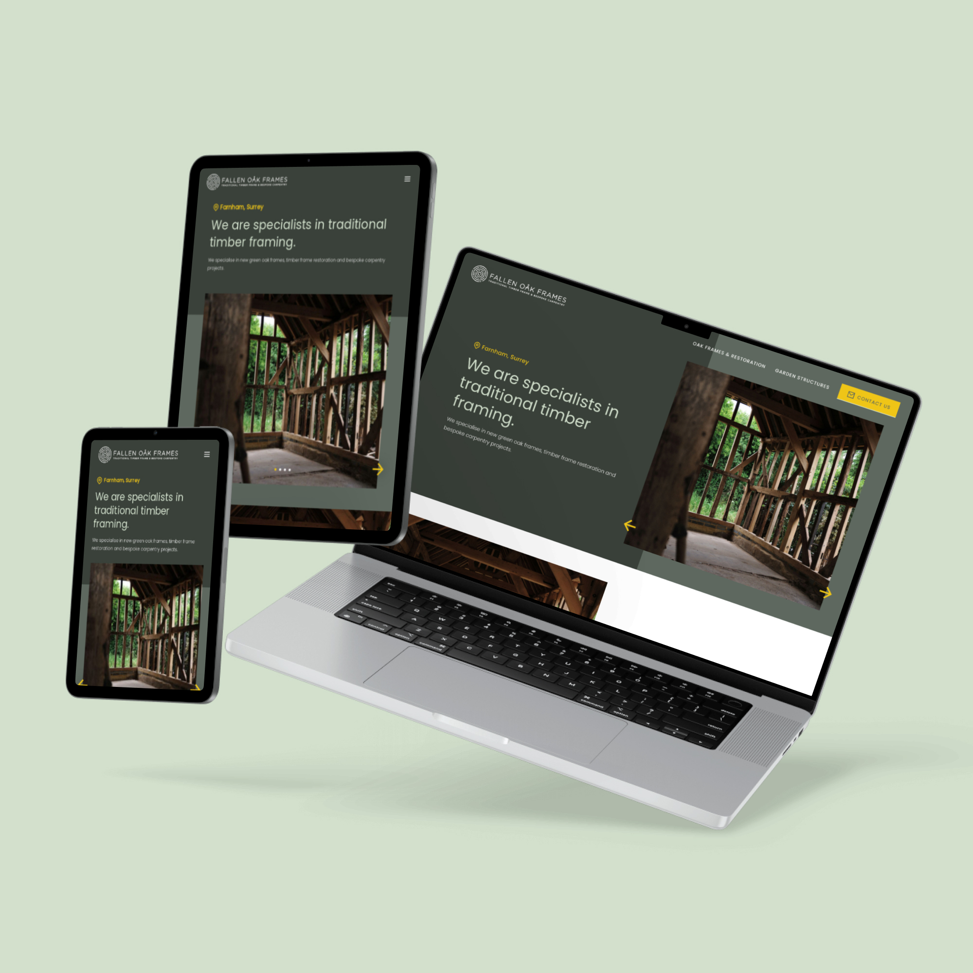
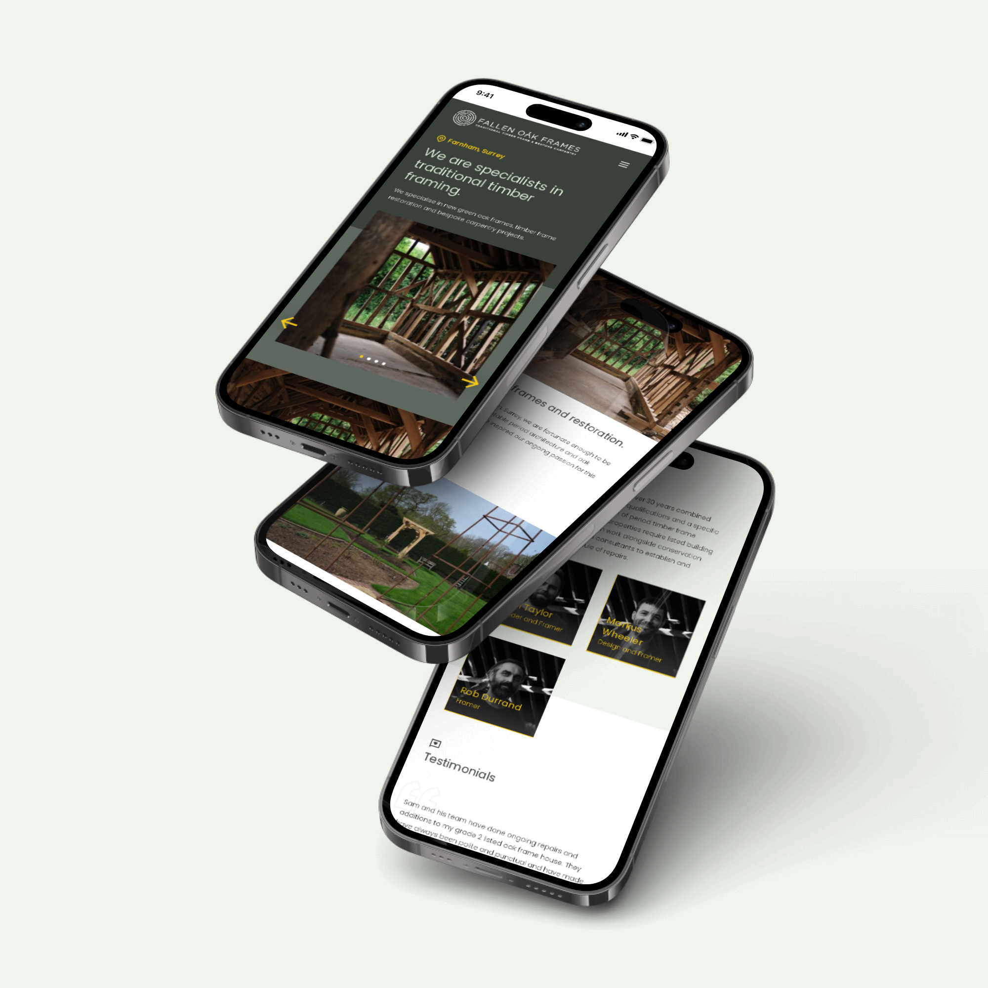
After client approval, the design requirements and IA informed the initial page structure and the branding package fed into building a component library, based on an ever-growing design system developed by Havish Design. This helped set up an effective design environment in Figma, enabling using components, colours and typography with agility. The first delivery to the client was the overall look and feel presented in the home page hi-fi UI design. The feedback captured was incorporated into the design of the remaining screens. This iterative cycle of feedback and improvement continued until the design was completely aligned with the stakeholder requirements. Following this, the dev-ready designs were developed into a website, tested and then released with minimal friction, resulting in a made-to-measure digital experience for the user and a highly satisfied client.
Fallen Oak website
View the live website
Design files
View the original Figma file



Project Reflection
The project detailed here for Fallen Oak Frames followed a format that has matured throughout the process of completing various projects at Havish Design. This helped to build confidence that an extensive project could be completed with agility and delivered according to the client‘s needs within a relatively short time frame. They felt in control of the direction of the project while feeling supported, ultimately resulting in a digital transformation that assimilates both the stakeholder and user needs. Fallen Oak now have a robust brand and user-friendly platform that brings awareness to their unique services and products, with the potential to boost company growth.
More projects
Yapari: AI-Powered Learning
AI-powered learning that transforms curiosity into action, generating gamified courses on any topic for accessible, engaging education.

Simplifying Ticket Buying
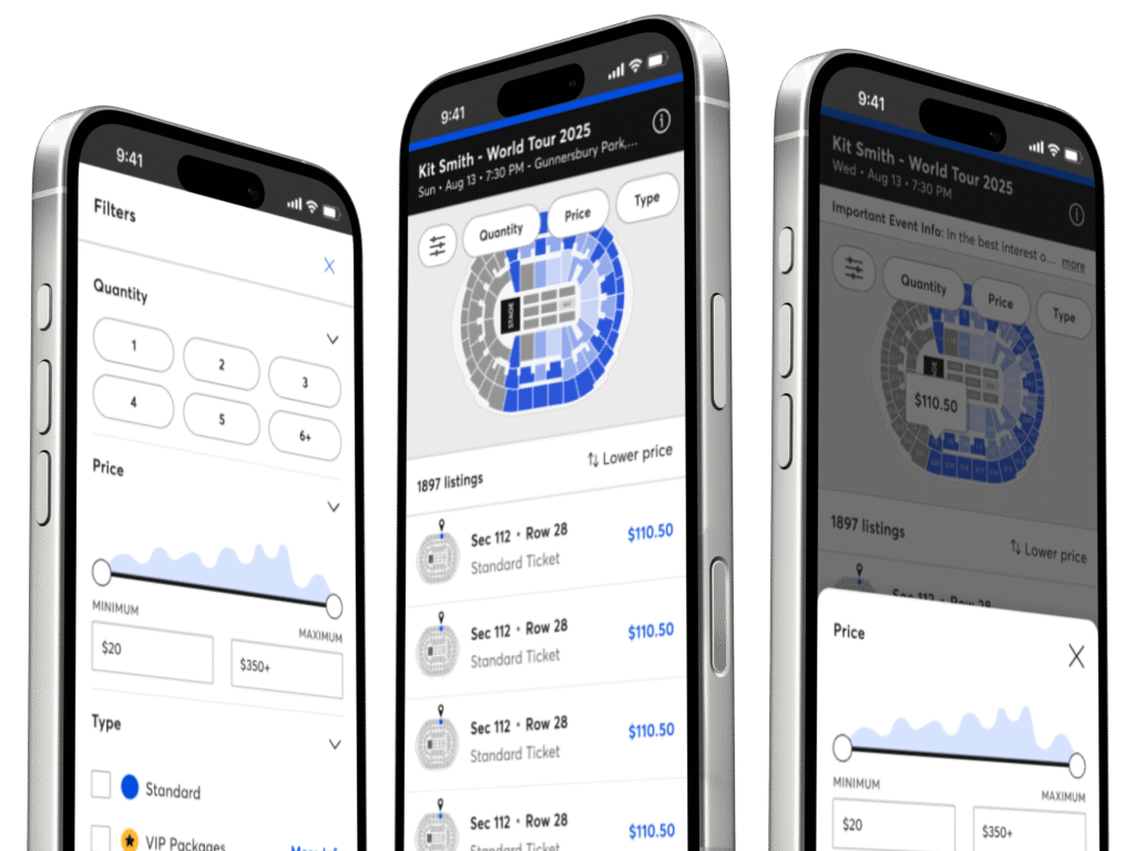
Elevated the Event Details Page with a modern design and smoother ticket selection, delivered through incremental improvements.
Redefining the Smart Queue
A fan-first vision that makes waiting painless through proactive prep, guidance, transparency, and a flexible, accessible UI.
