Shared EHR Optimisation
Design support, prototyping and user research for the UK’s leading shared electronic healthcare record system.
Project overview
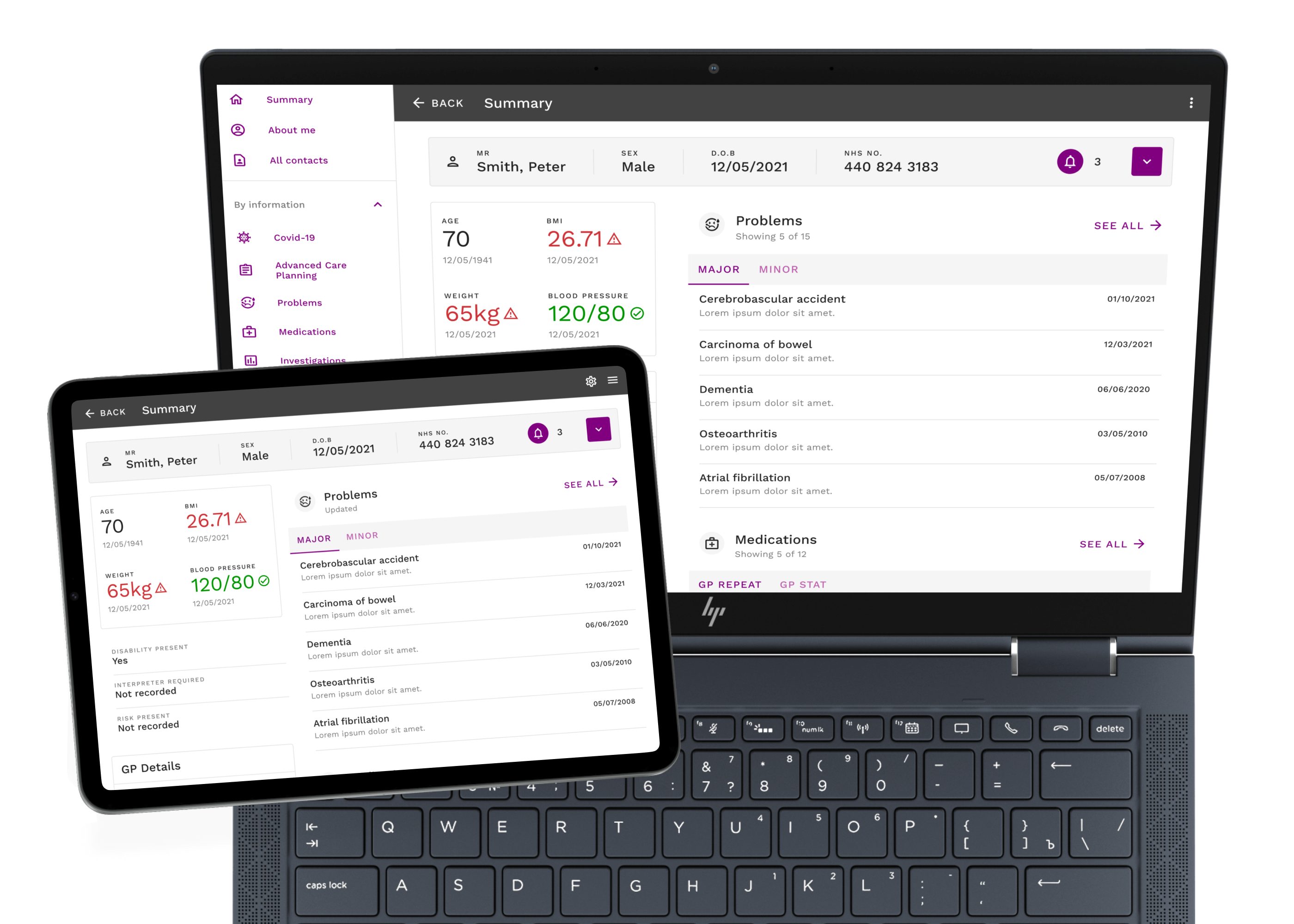
This project was carried out for a company that is an innovator in the digital healthcare domain, providing UX support for the UK’s leading shared electronic healthcare record system (EHR). The EHR enables a huge range of healthcare professionals (HCPs) to share patient data across local authorities, care services, trusts and other healthcare organisations. The system works by extracting data from the local systems used throughout the different care settings and amalgamating it into one integrated record. Along with equipping HCPs with rich patient data it also empowers patients by allowing them to access their records. The purpose of this project was to conduct user research to inform the improvement of a new version of the EHR that had been built into a sophisticated prototype. The aim was to generate data from a wide range of healthcare stakeholders to identify gaps, overcome pain points and understand user needs to refine this next-generation prototype.
Process
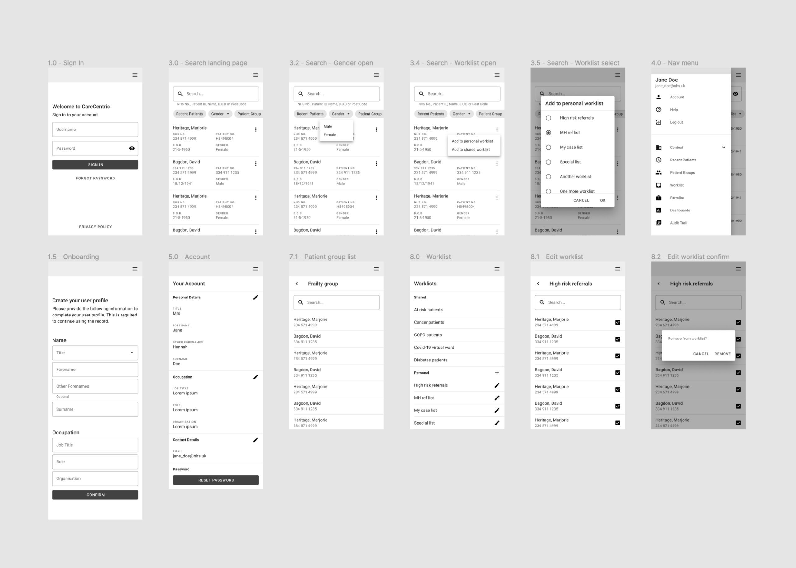
There were three main goals to achieve during this project. The first was to provide design support for the areas of the system outside of the patient record itself, which included the login, search and patient lists. This had yet to be redesigned in the new prototype. To support the process of designing this experience an expert review of the currently deployed EHR was conducted to empathise with any existing problems users may encounter. Following this, a user flow was sketched out and mid-fidelity wireframes were created. The second project goal was to gather extensive user-generated data to understand more about the transactional needs of a wide range of healthcare stakeholders by conducting 16 individual and 3 group usability testing sessions. Insights from the data gathered were then extracted through a thematic analysis. Lastly, the final project goal was to leverage this data and refine the design concept through iterative prototype testing. The outputs from this were an enhanced prototype, including design recommendations delivered with a style guide and component library. With a wealth of newly generated data, there was a subsequent decision to facilitate a design thinking workshop to further generate potential solutions through a stakeholder discussion and crazy 8s.
Client
UK’s leading Shared EHR
Agency
Fishawack Health
Duration
12 weeks
Test
Expert review
Usability testing
Define
User flow
Thematic analysis
Design
Wireframes
Enhanced prototype
Ideate
Design thinking workshop
Stakeholder discussion
Crazy 8s
Design support
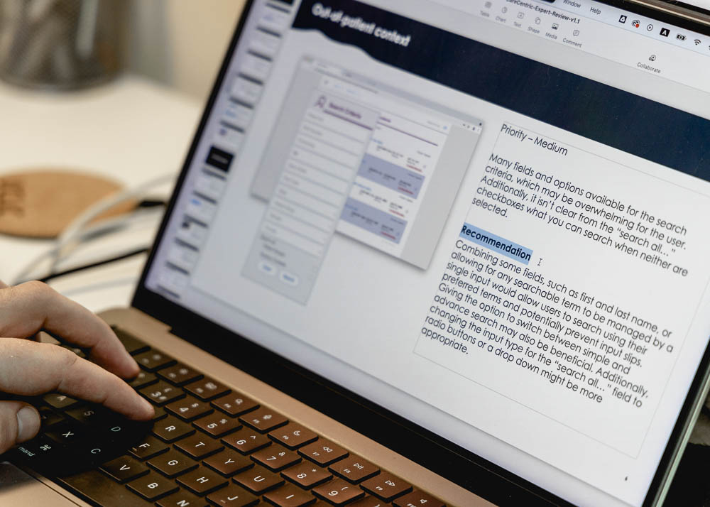
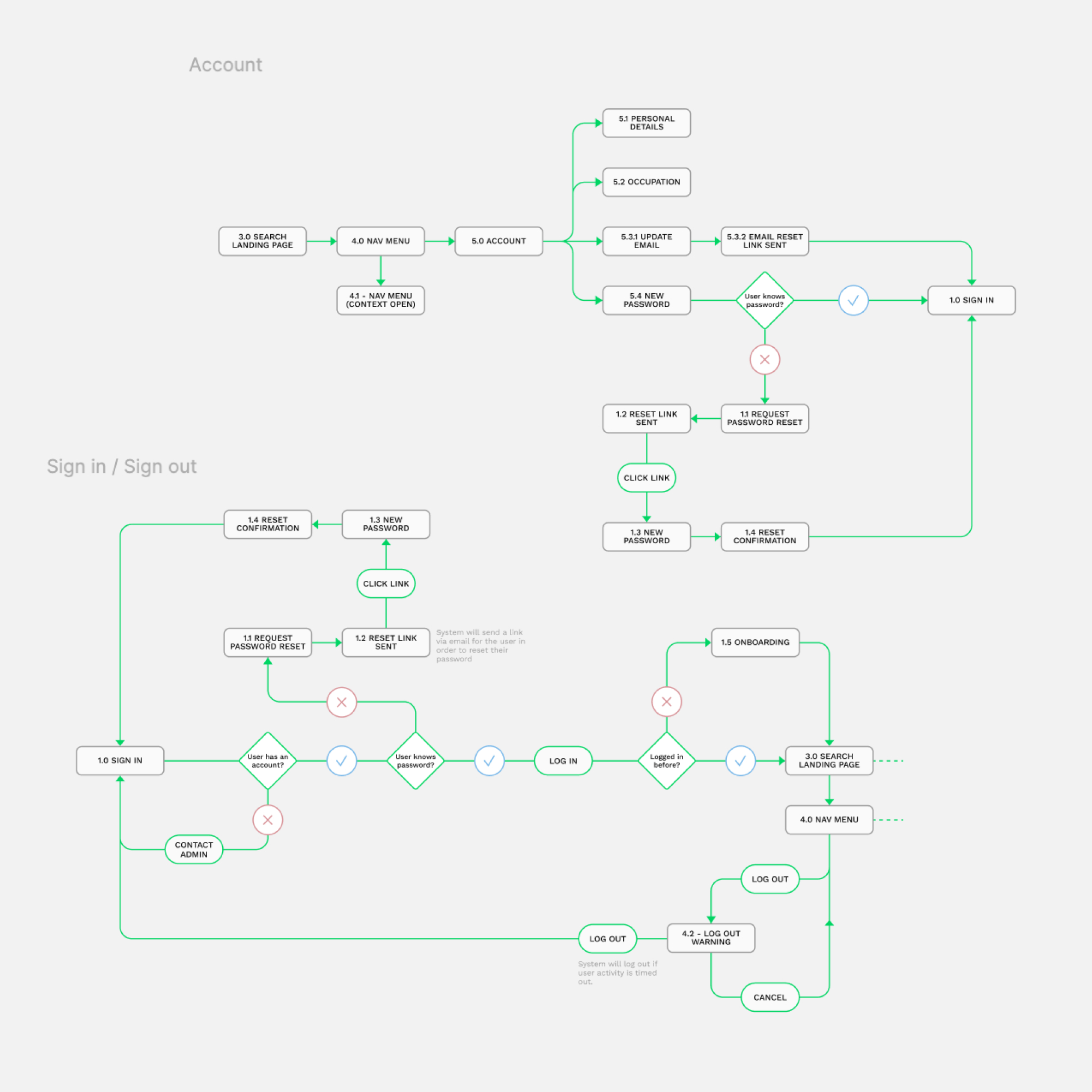
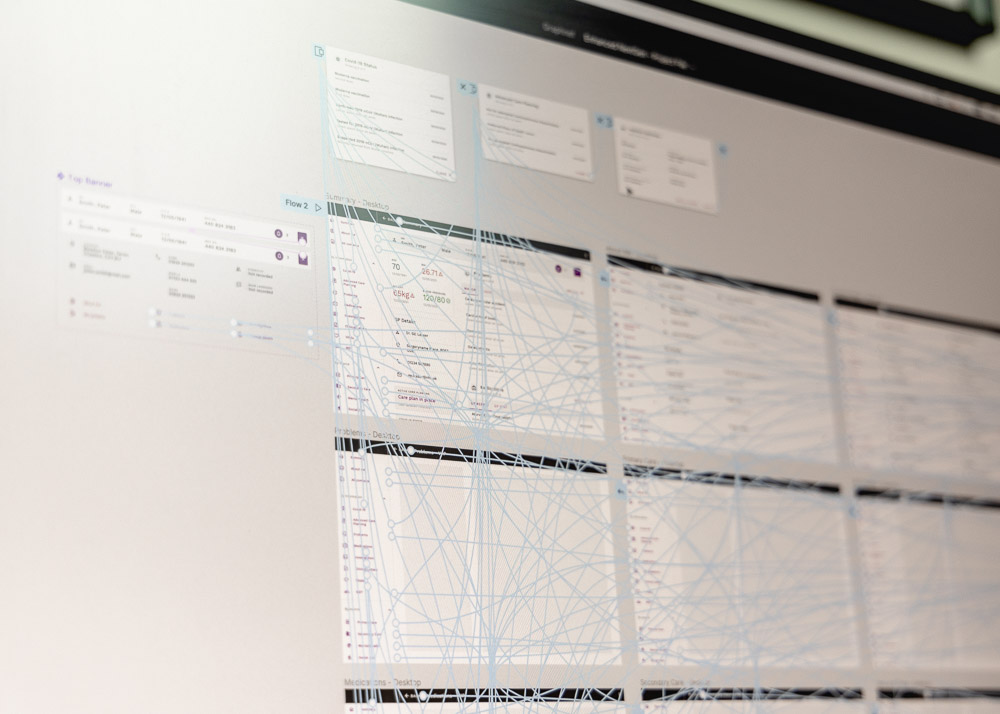
Accessing a patient record on the EHR can either be done directly through another system, for example, a social worker may have a record up on their business-as-usual (BAU) system where they can click through and launch the EHR for that same patient. Alternatively, the HCP can log in directly to the EHR, search for a patient and open their record. The latter behaviour keeps the user entirely within the EHR. Therefore, enhancing this experience will promote the potential transition away from the BAU system to using the EHR as the preferred patient record system. Designing this experience began with an expert review. Leveraging Jakob Nielsen’s heuristics helped to empathise with the user and understand the existing problems with the current system. A resulting list of recommendations was produced, which later was used as a springboard for ideation. Next, a user flow was sketched out to detail the user’s path from signing in to searching for a user. This defined what screens were necessary and laid out the logic the user has to navigate through. Based on this and the design recommendations discovered in the expert review, a series of mid-fidelity wireframes were designed. This was as far as the client wanted to progress with the design outside of the record itself. It was proposed that the wireframes could be used to create a prototype or act as a basic stimulus to elicit user feedback and test this concept.
User flows
View this asset in more detail
Wireframes
View this asset in more detail
User-generated data
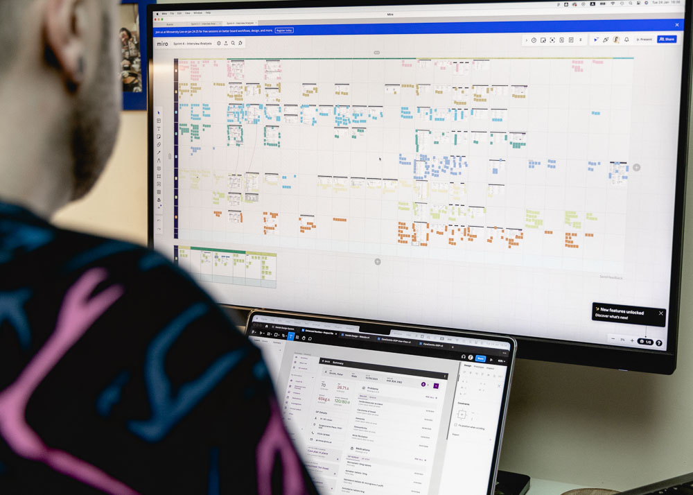
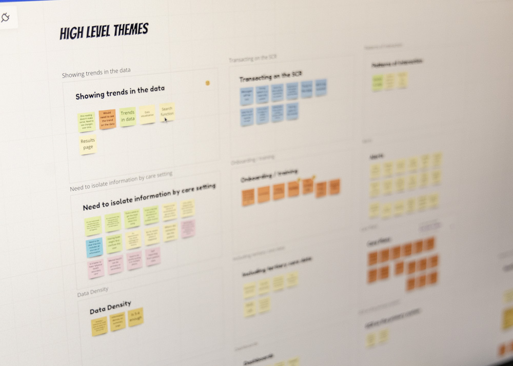
The main advantage of the EHR is that HCPs from all across the healthcare ecosystem can utilise the most up-to-date shared data. This means that a wide variety of types of HCPs, or users, interact with the EHR, such as GPs, consultants, social workers, community matrons, occupational therapists, paramedics and even administerial staff. Therefore, to truly understand it the user research needed to be conducted with a large range of user groups. To achieve this, a balanced amount of each of these HCPs needed to be recruited. At first, this proved to be difficult due to busy schedules and finding candidates with sufficient experience using the EHR. Ultimately, the usability testing was spread throughout the sprint cycles with appropriate users as and when they became available, overlapping with the time to iterate on the prototype design. Fortunately, after a reduced first round of individual testing, a UK hospital trust facilitated attendance at a conference where 3 group usability testing sessions were conducted. Data was analysed and funnelled into prototype design, which was then ready to be tested in subsequent individual sessions, resulting in 16 in total. Analysis of all sessions was amalgamated and a thematic analysis produced 12 main themes, as well as page-by-page usability commentary.
Prototype testing
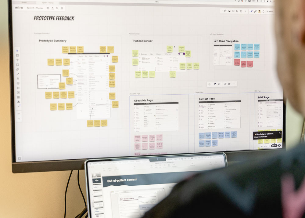
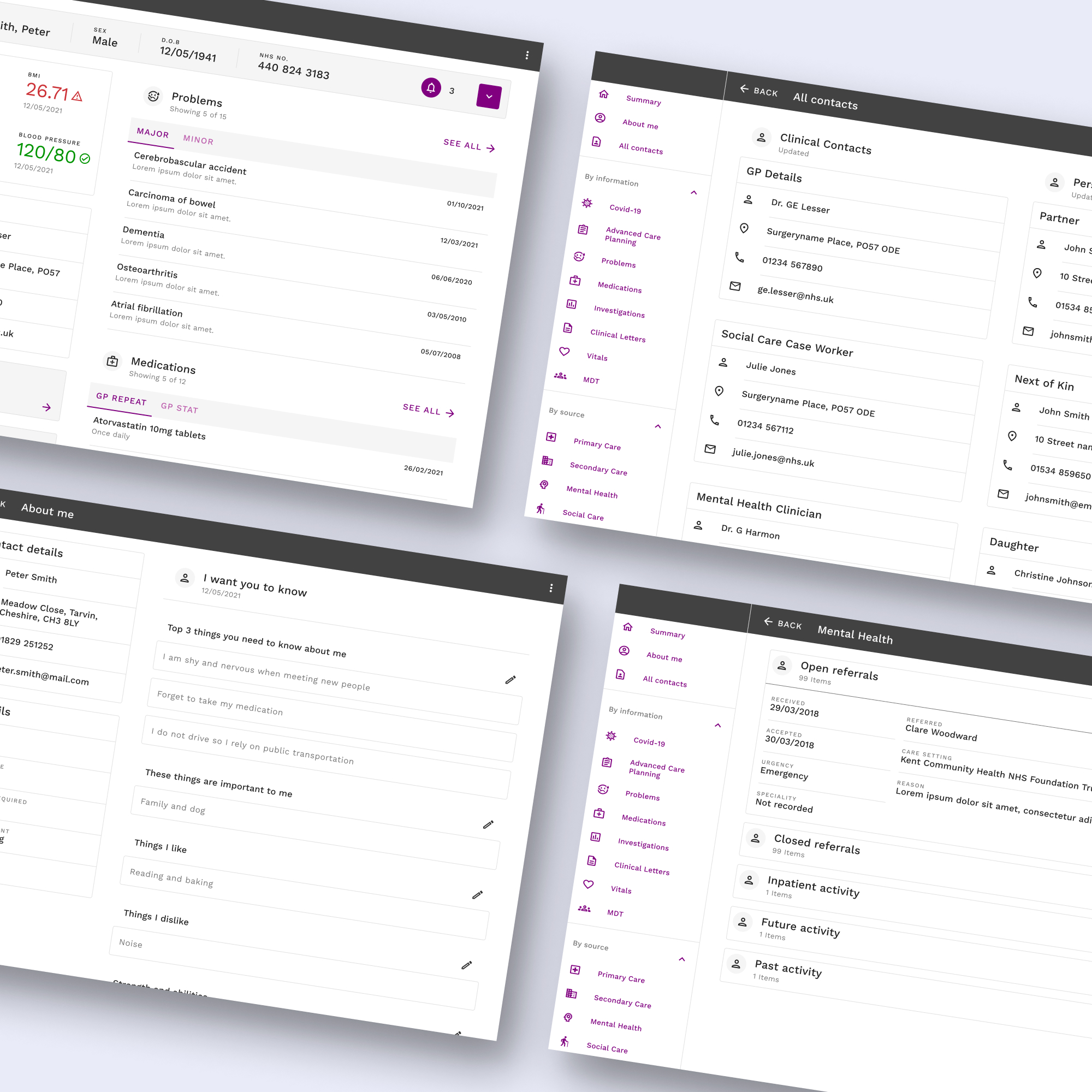
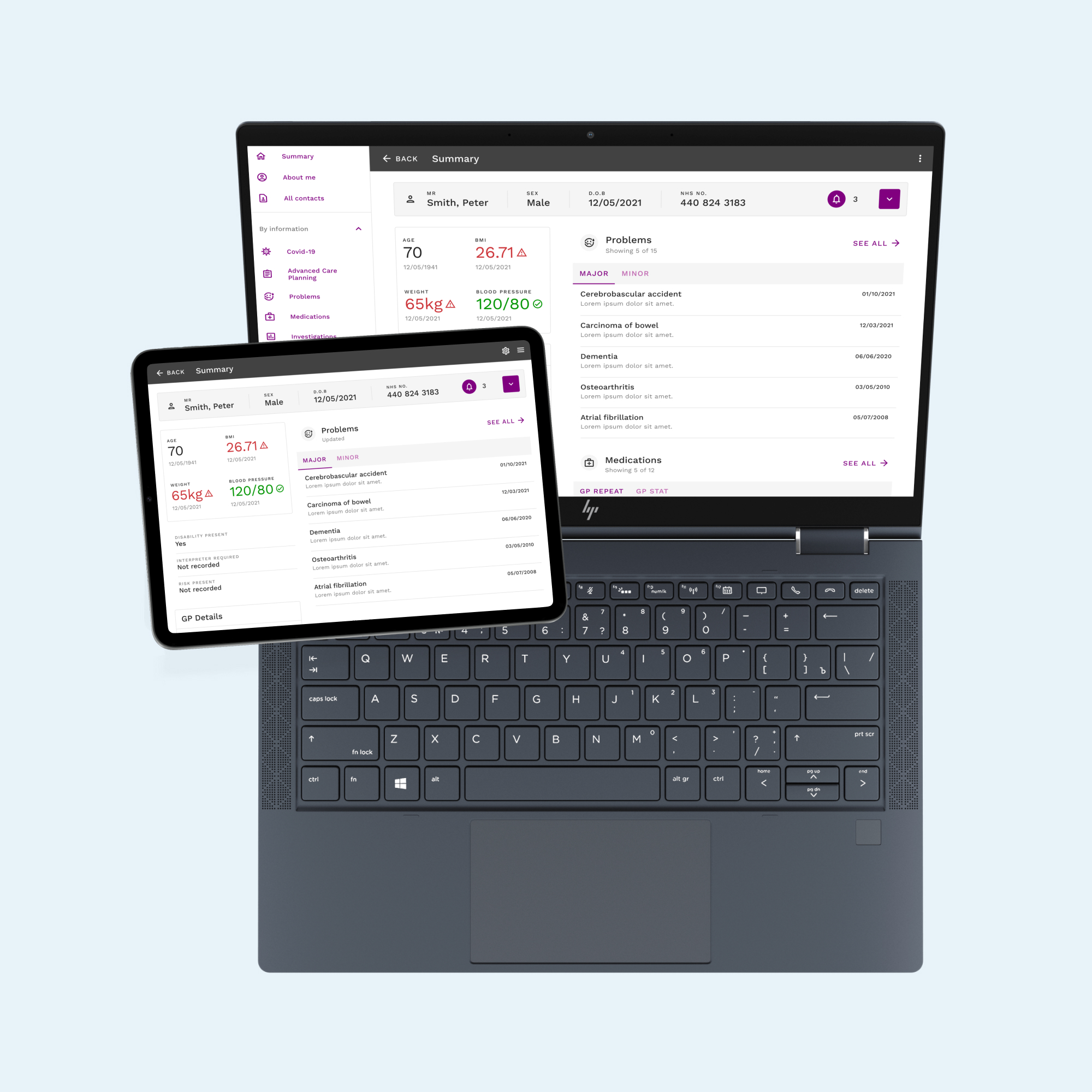
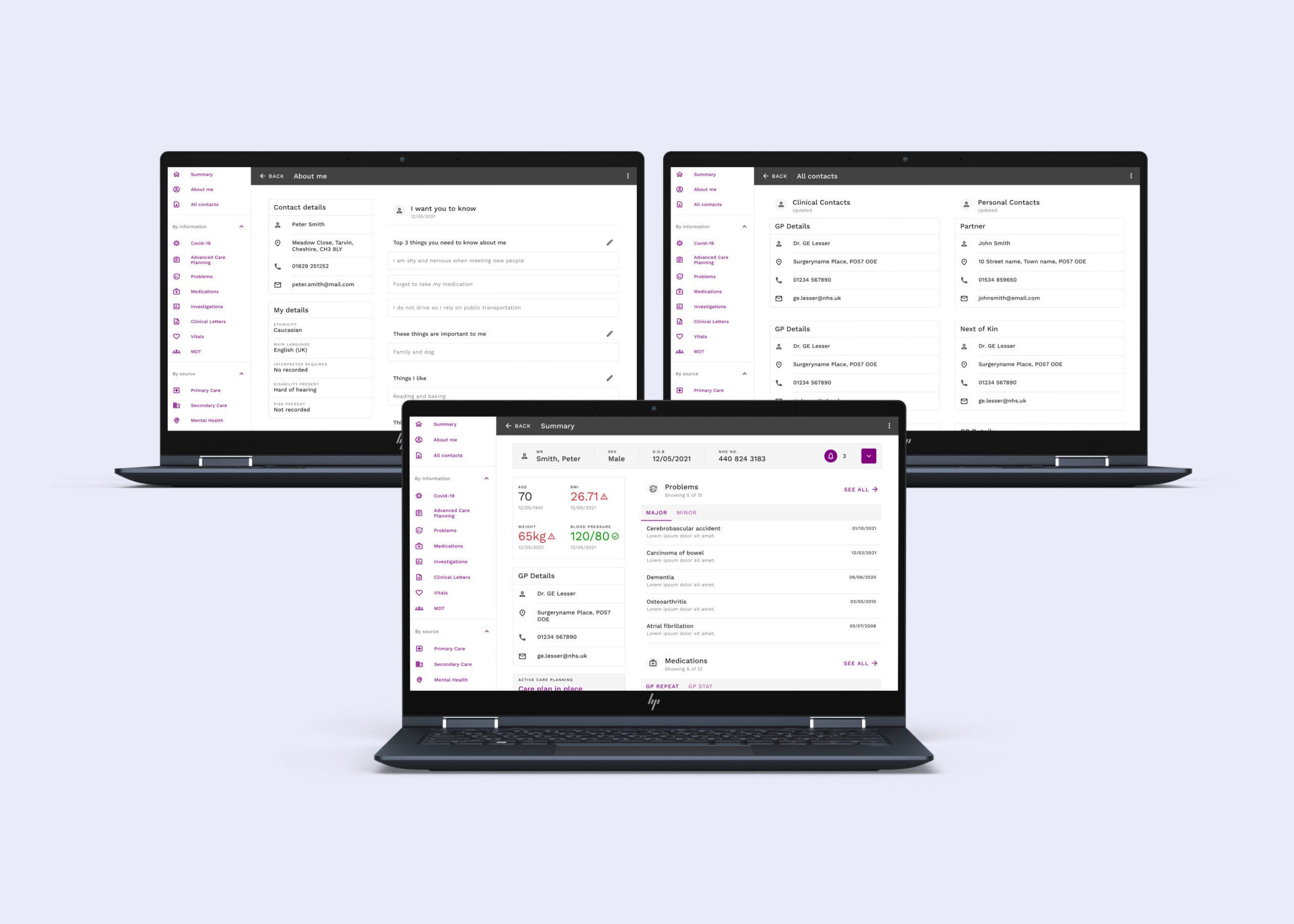
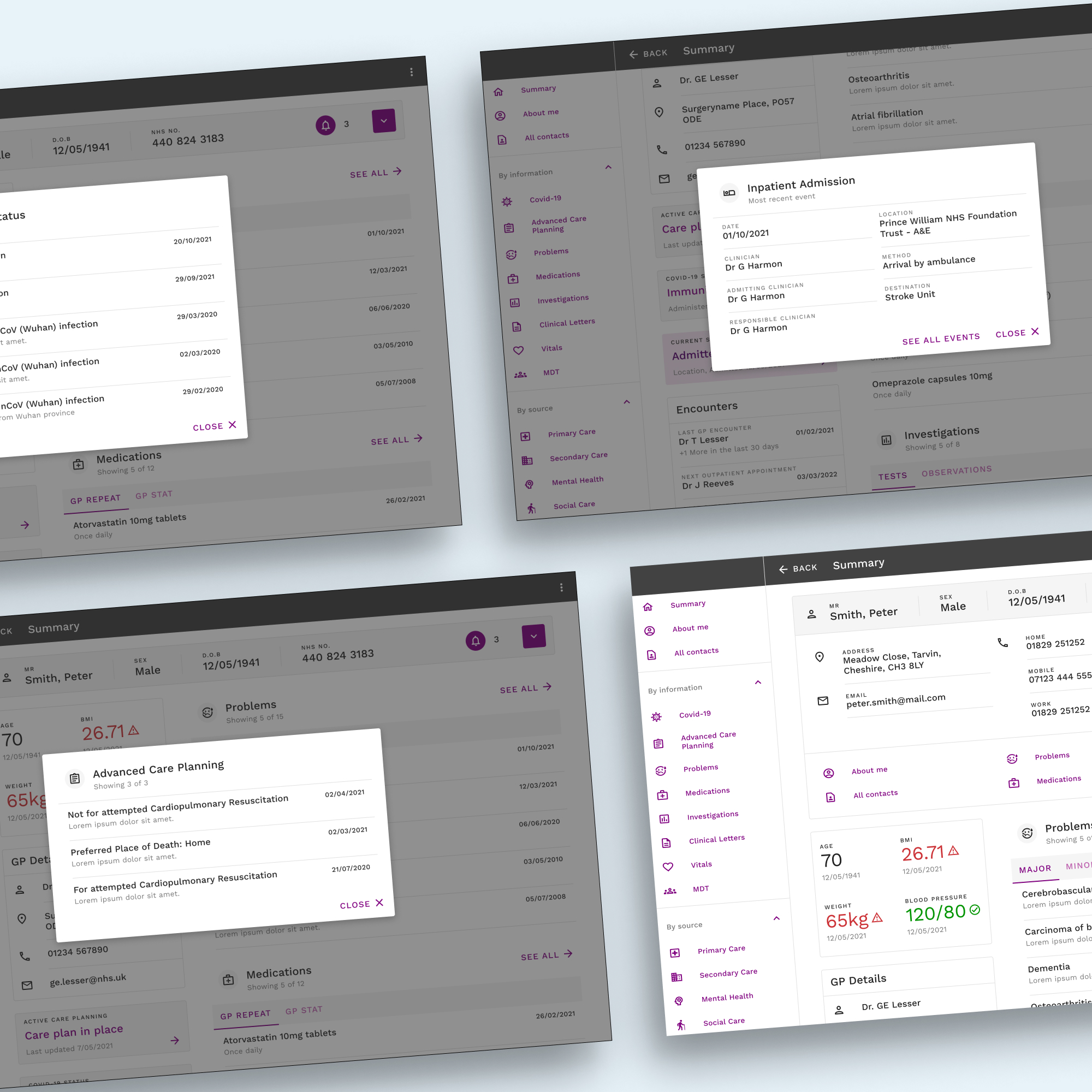
As the original project plan needed to be adapted due to barriers that needed to be overcome with recruitment, prototype design focused on creating a single enhanced iteration. In total, there were 4 rounds of testing. The first 3 rounds concentrated on gathering as much data from testing the client-built prototype. Simultaneously, the data was analysed and fed into an enhanced design created within Figma. As the analysis progressed, several areas of improvement started to become clear. First, there was a lack of consistent and well-executed UI design across the components that made up the EHR, therefore, Google Material Design was adopted as a design system and a component library and style guide were built based on that. Once that was established, several testable design concepts were built into the enhanced prototype, including improved left-hand navigation, a patient banner containing critical information, design patterns for modals, reorganisation of the summary page and several redesigned pages found to be the most problematic. Once this enhanced prototype was ready it was subjected to the final round of 8 individual usability testing sessions.
Prototype
View this asset in more detail
Component library
View this asset in more detail
Design thinking workshop
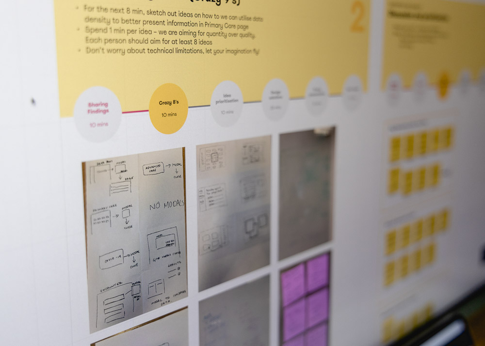
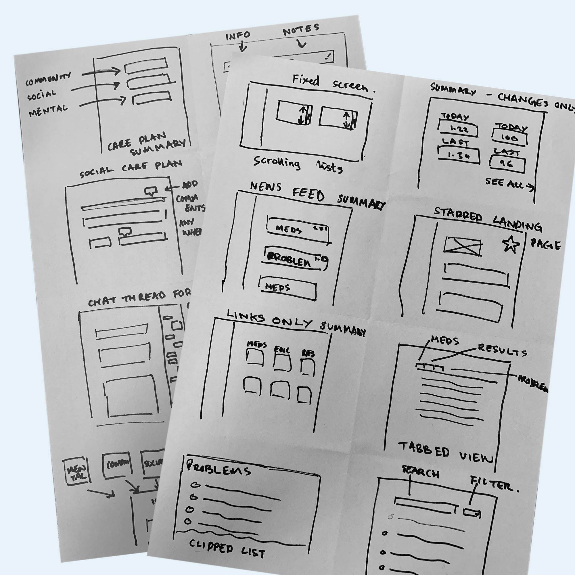
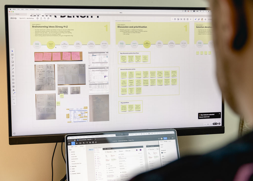
With a wealth of data produced from 4 rounds of usability testing of both the new version built by the client and the enhanced Figma prototype, it was decided to facilitate a design thinking workshop to further ideate more design concepts and define a realistic direction for the future of the EHR. Out of the 12 themes resulting from the thematic analysis, 3 were prioritised and formed the structure of the workshop. These key themes focused on data density, navigation and usability, and the potential for transactional interactions. The workshop was run as a hybrid session taking advantage of the whiteboard software, Miro, as the centralised platform for note-taking and organisation. For each prioritised theme, a crazy 8 activity was run to rapidly generate sketches to encourage further concept generation. After this, an open discussion and prioritisation were held to determine a foundational plan of action for each of the themes.
Project reflection
This project attempted to follow a conventional design thinking approach of moving through cycles of empathising with the user, defining the problem, ideating a solution, building a prototype and testing that prototype. It was originally planned that several unbroken cycles would take place, incrementally moving towards the most effective solution. Albeit not as many as planned, there was still an opportunity to make one complete cycle. This project showed the importance of achieving flexibility in the planned sprint cycles and adaptability with recruitment and planning. One other significant learning was understanding how critical it is to have meaningful and accurate content populating a prototype. Trying to extrapolate insights from information-seeking and information-processing behaviours was difficult when the content either confused the user or left too much up to the imagination. To conclude, iteration cycles could have continued and further improvements could have been mapped out, however, as the agreed project length came to an end, all the completed outputs were wrapped up into a deliverables pack providing the client with a clear journey to the next market-ready version of the EHR.
More projects
Yapari: AI-Powered Learning
AI-powered learning that transforms curiosity into action, generating gamified courses on any topic for accessible, engaging education.

Simplifying Ticket Buying
Elevated the Event Details Page with a modern design and smoother ticket selection, delivered through incremental improvements.
Redefining the Smart Queue
A fan-first vision that makes waiting painless through proactive prep, guidance, transparency, and a flexible, accessible UI.
